Brand refresh, 3D modeling, animation, marketing


A refreshing of the brand
Intermax is a major Internet Service Provider, & communications company serving North Idaho, Eastern Washington, & the Seattle area.
The brand was struggling with its image. Fonts were inconsistent across media. Too many, & again, inconsistent, colors. There was a lack of cohesive brand elements. The tone, the "vibe" of the brand, needed more consistency.
My job was to modernize, & simplify the brand while maintaining a professional, & at the same time, friendly, down-to-earth quality as well.
After stripping the brand down – really all I was left with was the company's existing logo. Deciding on typefaces, colors, & brand elements was the next step.
Existing Intermax logo
The new style–guide:
Intermax did not have an existing style–guide (a document which sets rules & helps organize the look and feeling of a brand); so creating a new internal style–guide was crucial, & the first step.
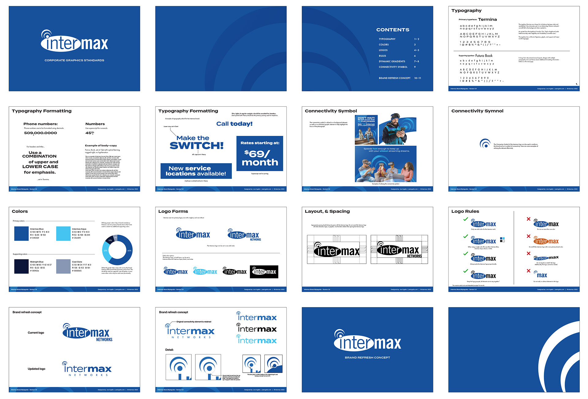
With style–guides, especially for large corporations, the more information the better. For example, not only is color information provided, but also color priority. What colors are more dominant overall in the brand? Which takes center stage, & which support it?

Brand Elements
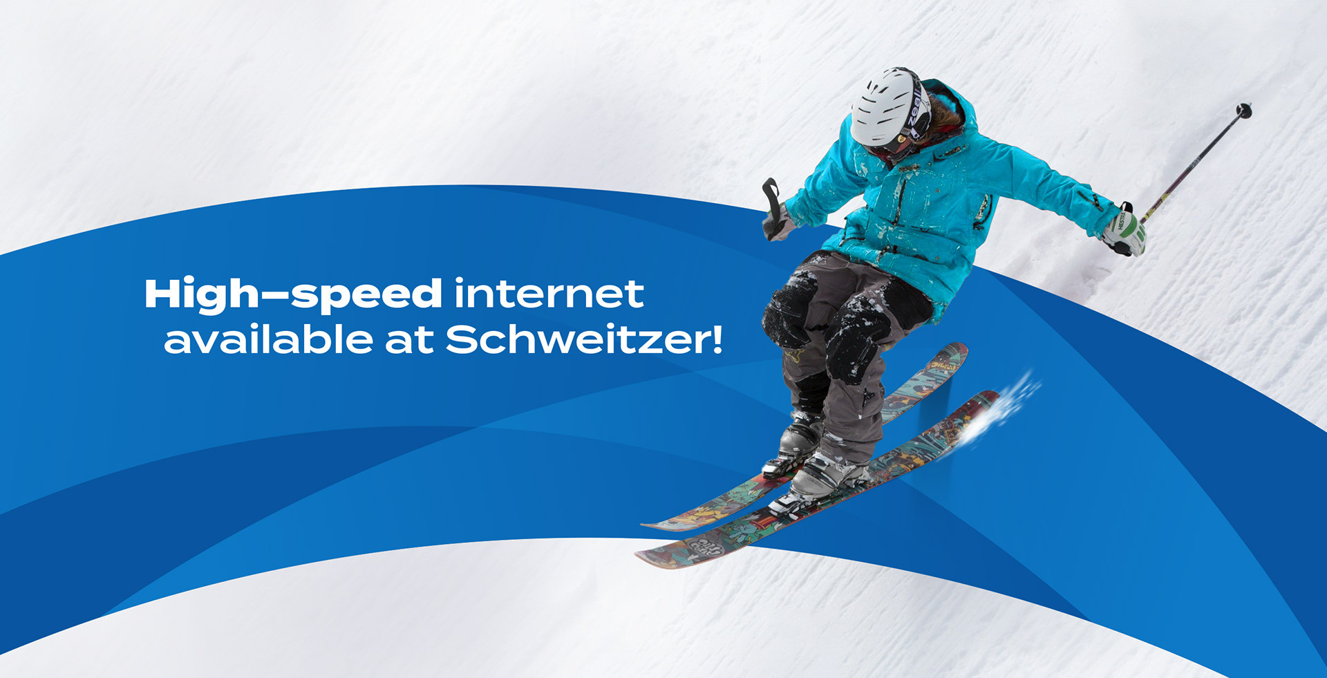
I took the ray element from the logo, dubbed it the connectivity symbol, & started to use it as a brand element. Its use can be up–front & direct, or used in more abstract & subtle ways.

Using the connectivity symbol in a fresh, dynamic way, & highlighting the devices & people who use those devices, was a core part of the brand refresh.
Examples of the dynamic connectivity symbol in use:
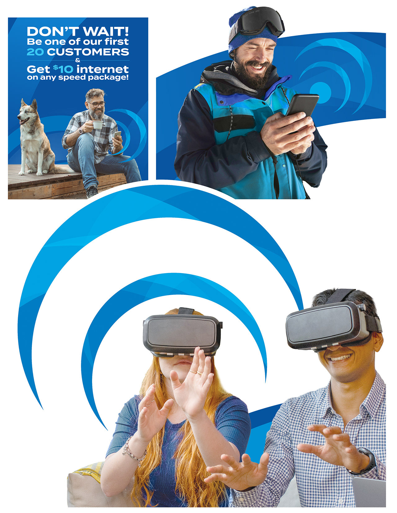
Digital ad. A more subtle use of the connectivity symbol:


The Typeface Termina, desgined by Mattox Shuler, was chosen as the primary brand typeface.
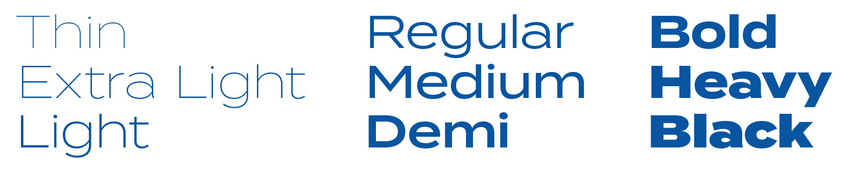
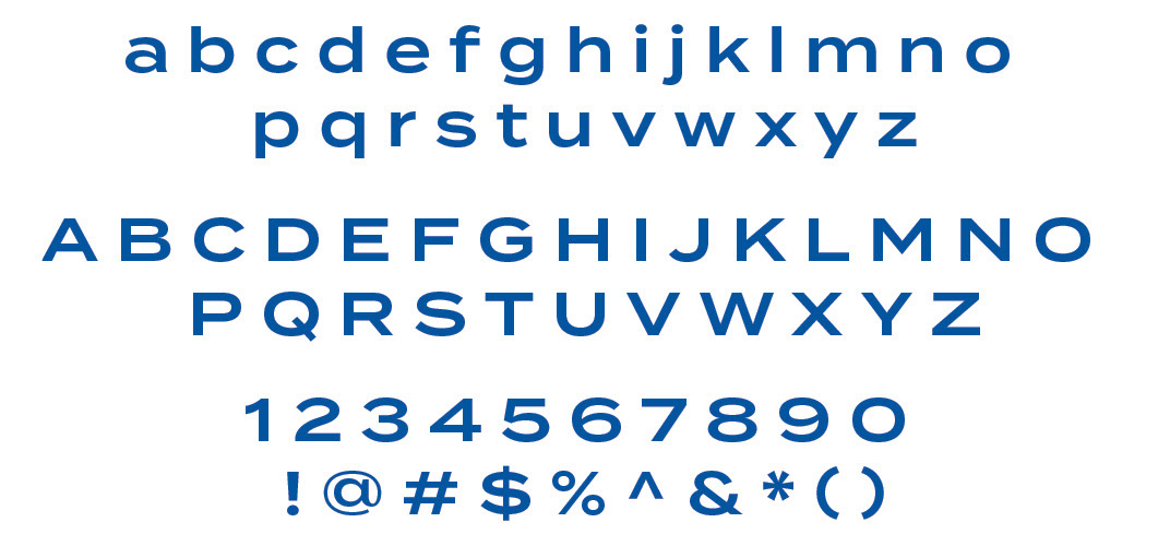
The Typeface is legible yet still has character, its wide letterforms allow the typeface to be used as both headers and body copy effectively.
The tagline
The company needed a tagline. Working with the director of marketing, we decided on the primary tagline of: Connectivity to the max.

The idea was to have a dynamic tagline. Switching the first word of the tagline – we can focus on a particular idea while maintaining the primary tagline.
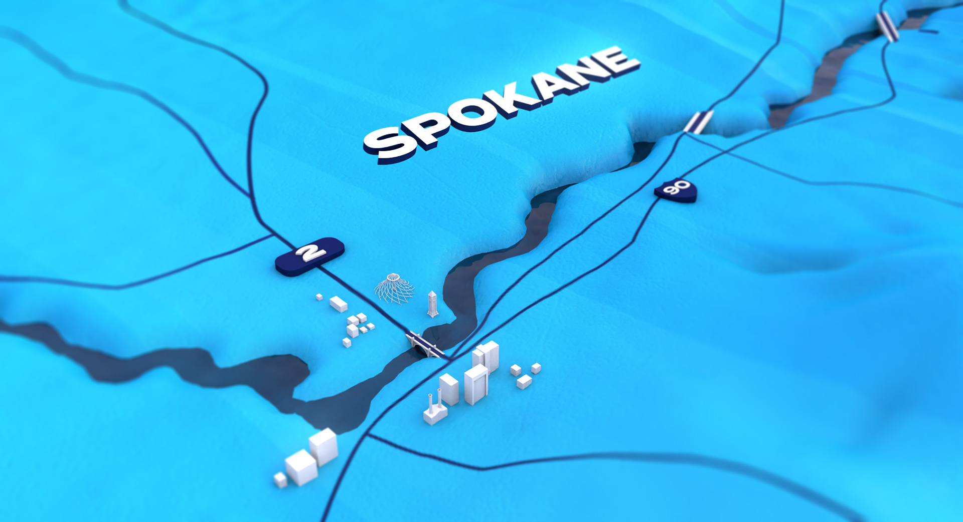
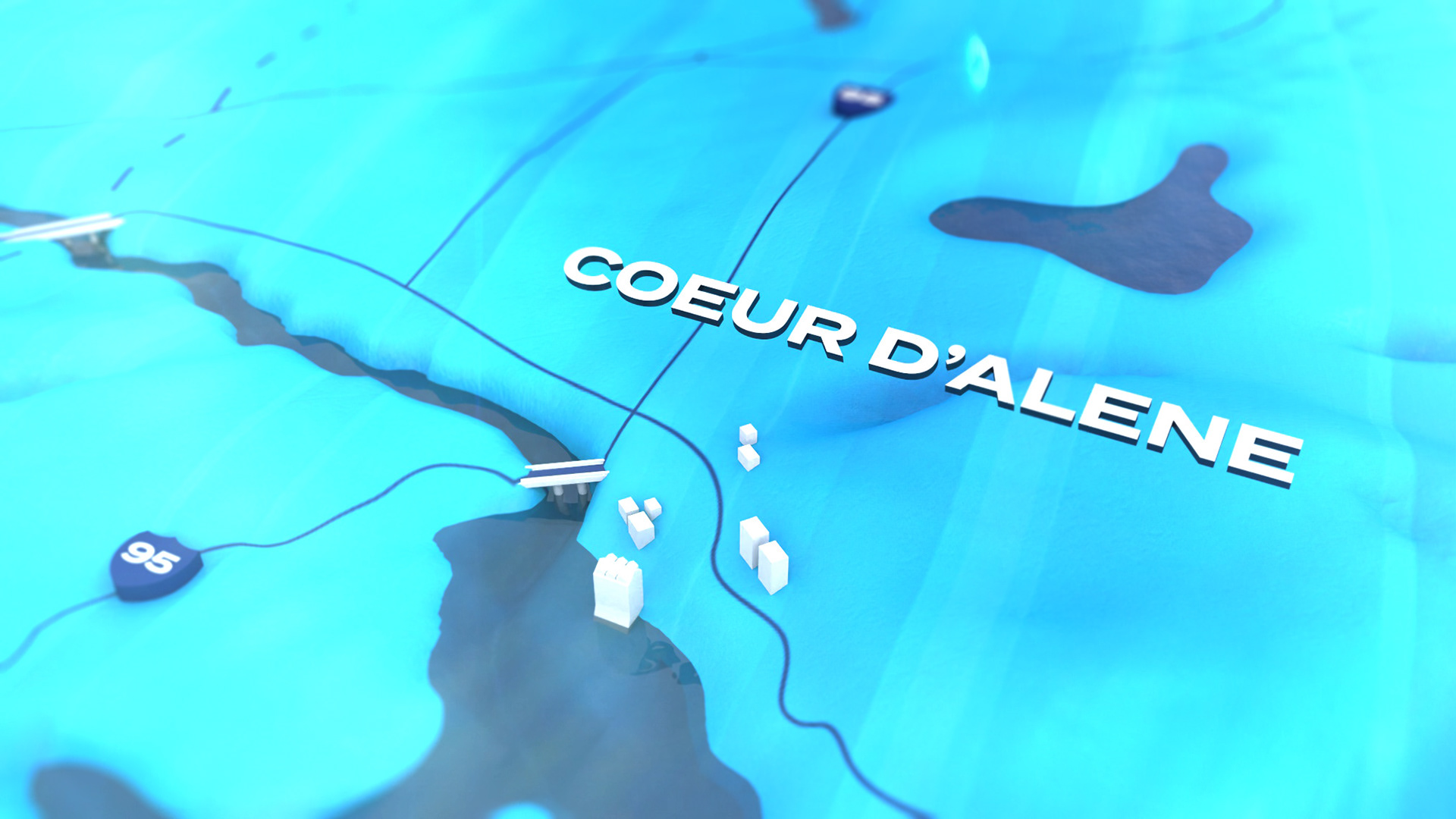
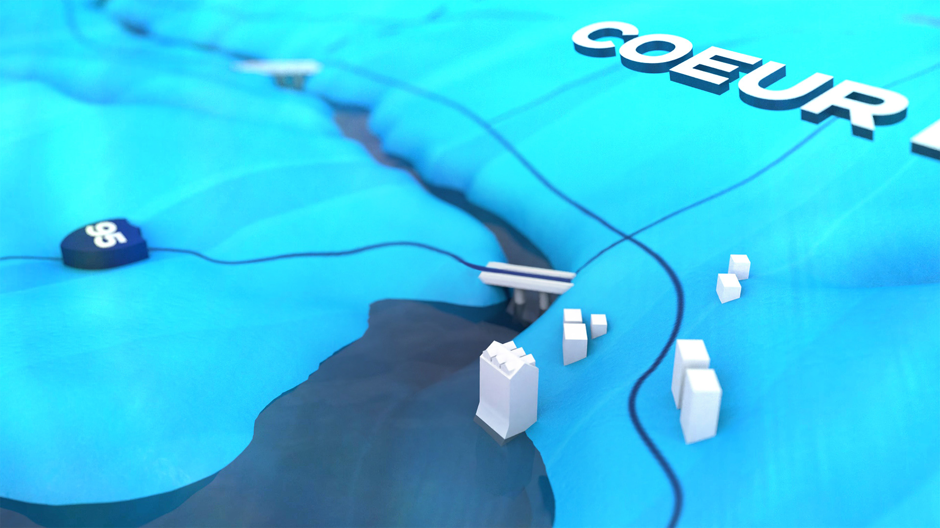
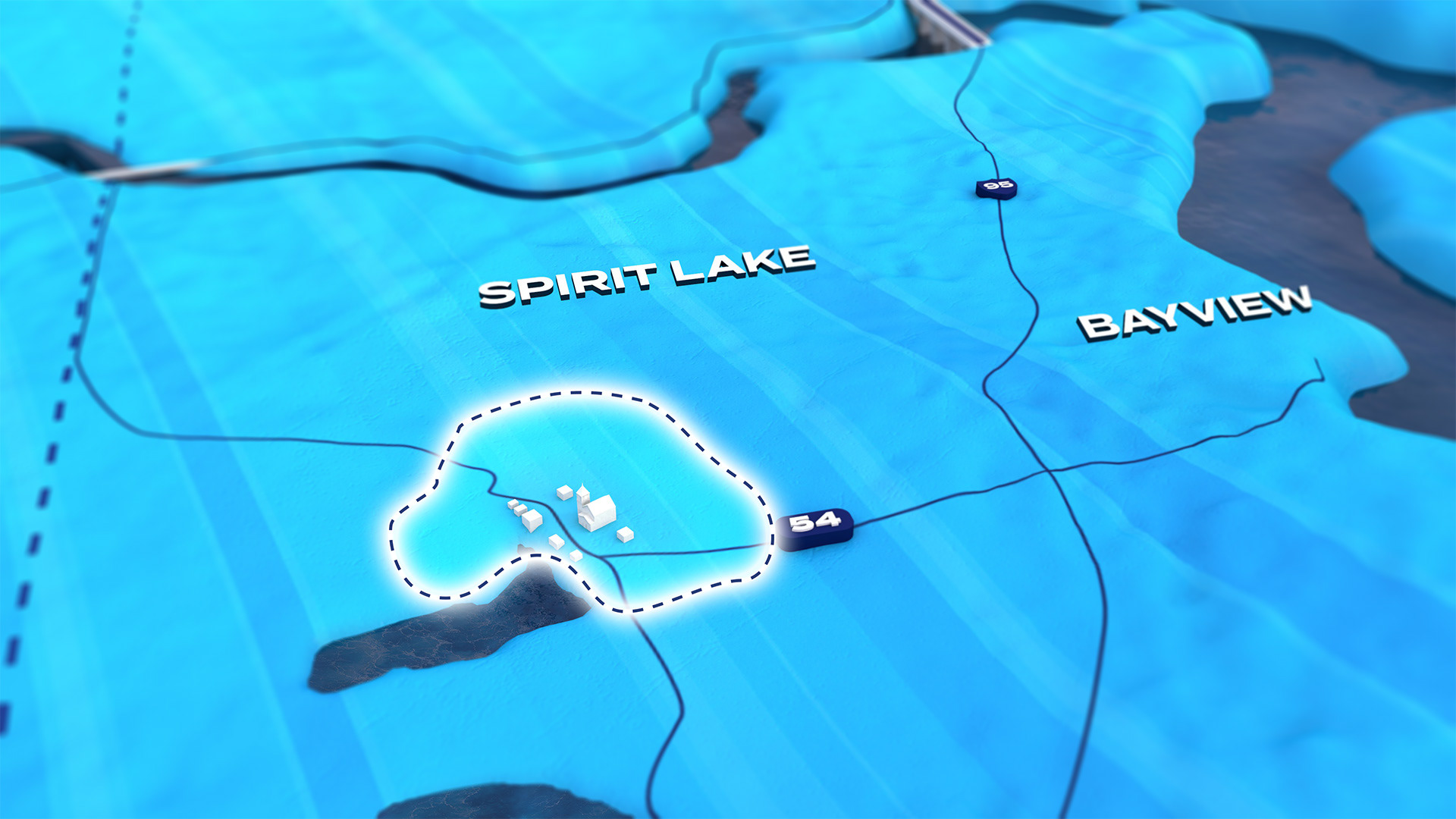
The Service Map
Intermax also needed a way to show their area-of-service – in print, digital, & animated media. While a simple overlay on top of Google Maps would work, we wanted something more interesting, something we could weave branding into, and be more engaging for the viewer.
I created a 3D map of the greater region which includes stylized representations of cities and larger towns in the area. It also includes tower locations and service areas.
3D models I designed for use on the map:
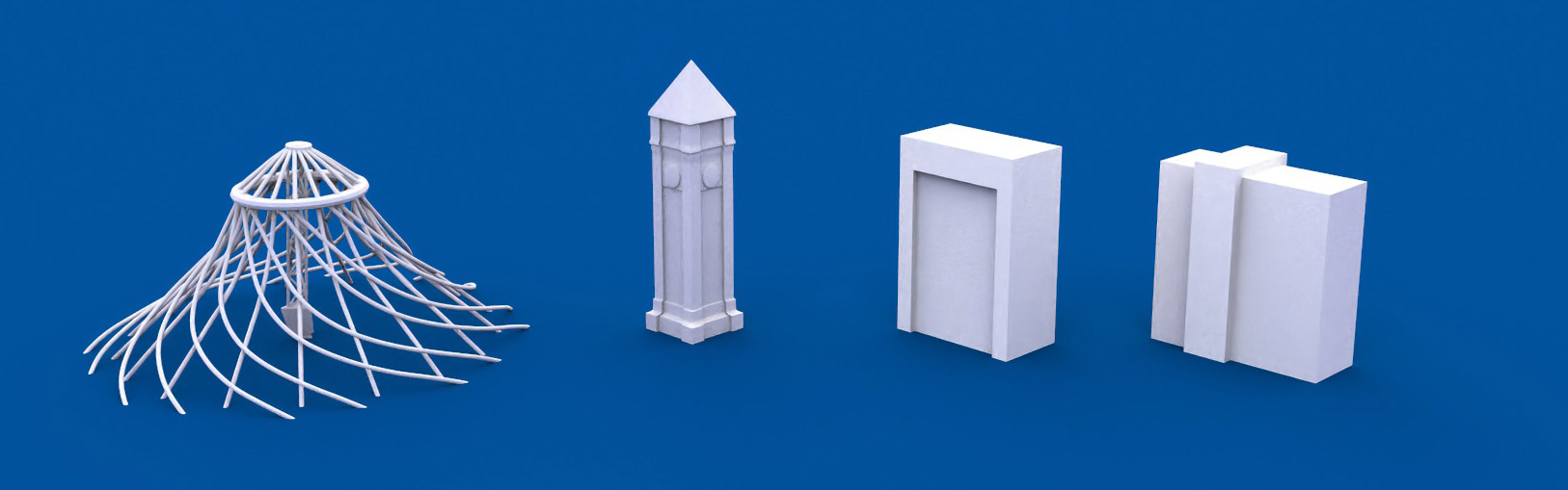
Abstractions of the Spokane Pavilion, Clocktower, Wells Fargo building, and The Grand Hotel.
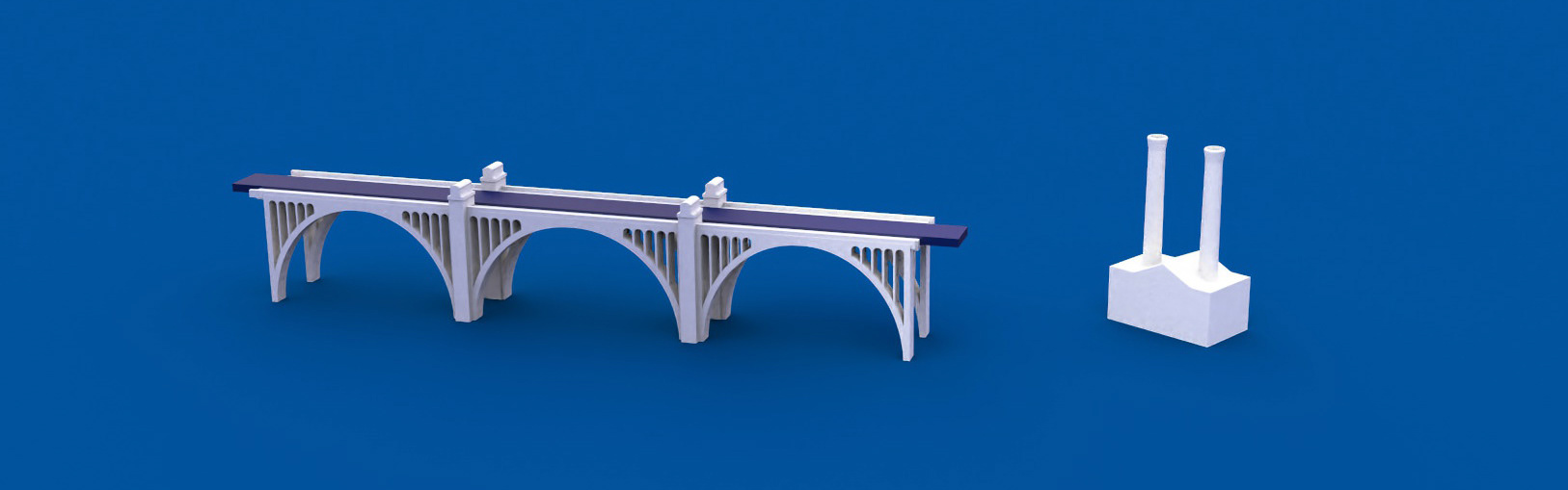
Monroe Street Bridge, & The Steamplant.
The buildings are stylized, symbolic, and have a purposeful low–poly, simplistic, feeling to them.
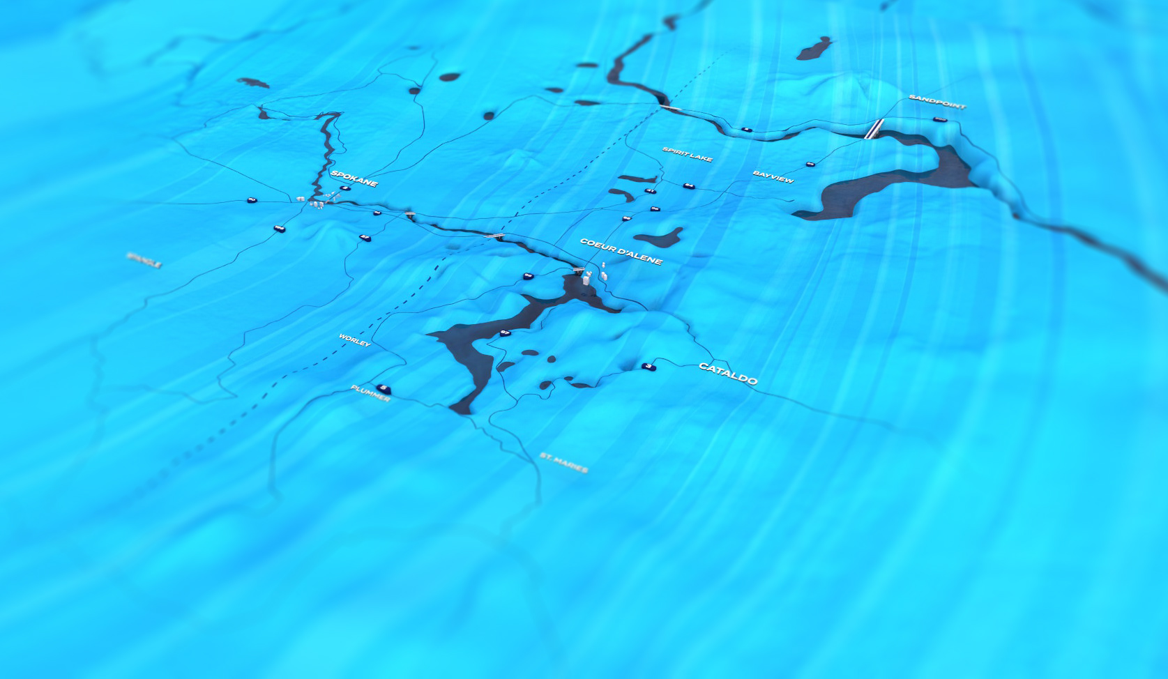

The same map can also be used (in this case, in print media) in more granular ways, showing a new tower's specific service area:
The animations
Service map animation
Using the map and assets I designed, I created the following animation. I was provided the script, hired voice talent and worked with them on the voiceover, and did the final sound mix.
The animation highlights the bigger picture of the North Idaho Intermax network:
The Intermax House animation:
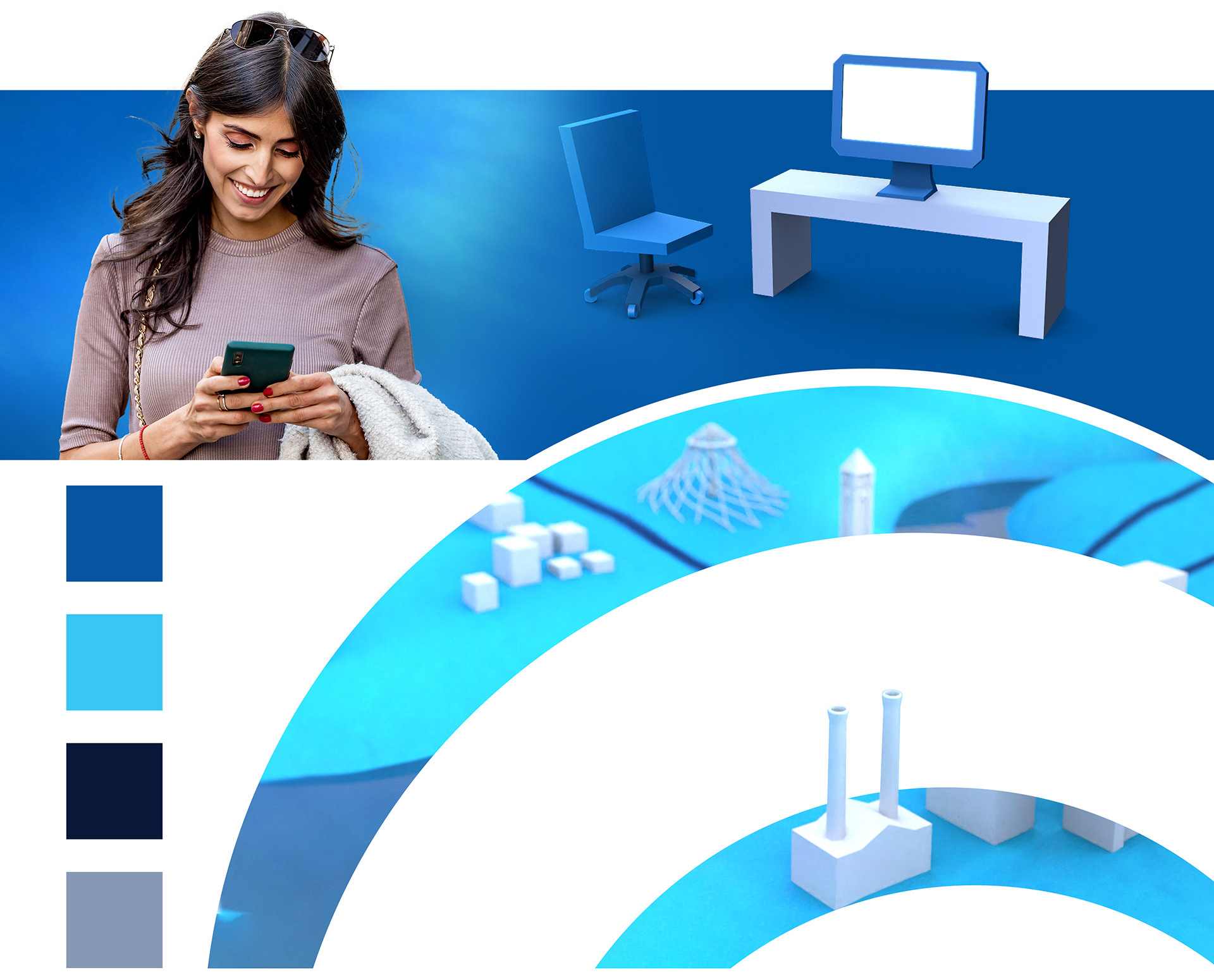
We also wanted to show, in a very simplistic & easy to understand way, internet service within a household. Showing the wifi travel through walls, connecting all devices. This animation is used on the website, and various digital media.
I designed the 3D models of the furniture and devices to fit in with the style of the building models on the service map. We needed to have one consistent look across all media.