Brand design, motion graphics & animation, rendering, sign design
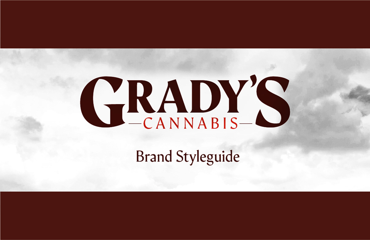
Grady's Cannabis is one of the first cannabis brands launching in New Mexico for 2022's recreational legalization in the state. For this company I did everything from logo design and branding, to motion graphics, sign design, interior renderings, and more.
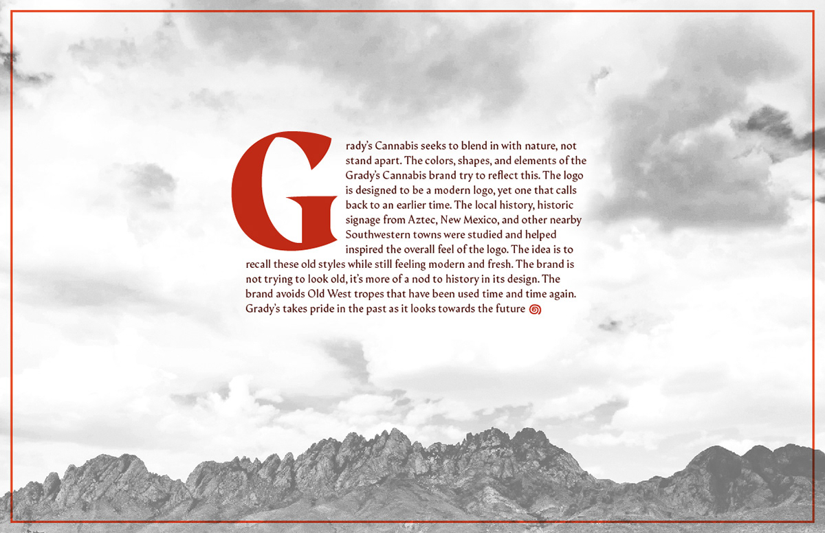
I started with researching the local area, and its history. I also studied historic signage from Aztec, New Mexico, where the dispensary is located. The idea is to recall these old styles while still feeling modern and fresh.
I wanted to strike a balance with the brand. While the logo pulls some inspiration from local history, I didn't want the brand to have an "old west" feel. The brand avoids old west tropes that have been used time and time again. No wagon wheels, or cheesy slab serif fonts here. We wanted to feel rustic, and show off some of the true farming roots of the company – and yet still be hip.
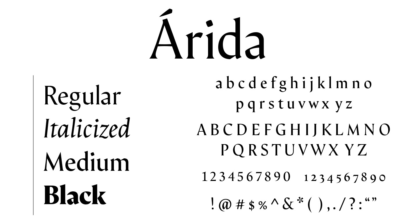
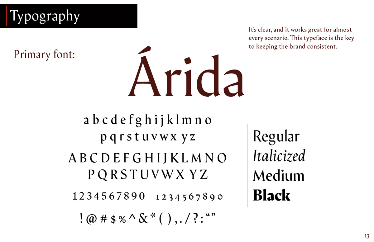
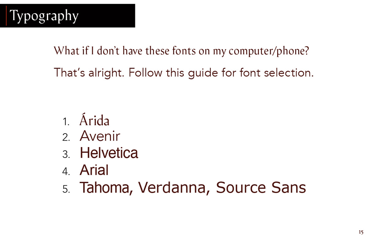
I chose Árida by Alfonso García as the primary typeface for the brand. It fits in with existing historic signage, and fits in with the local area. But it still feels fresh and modern. The logo in all its formats is set in Árida Black, specifically.
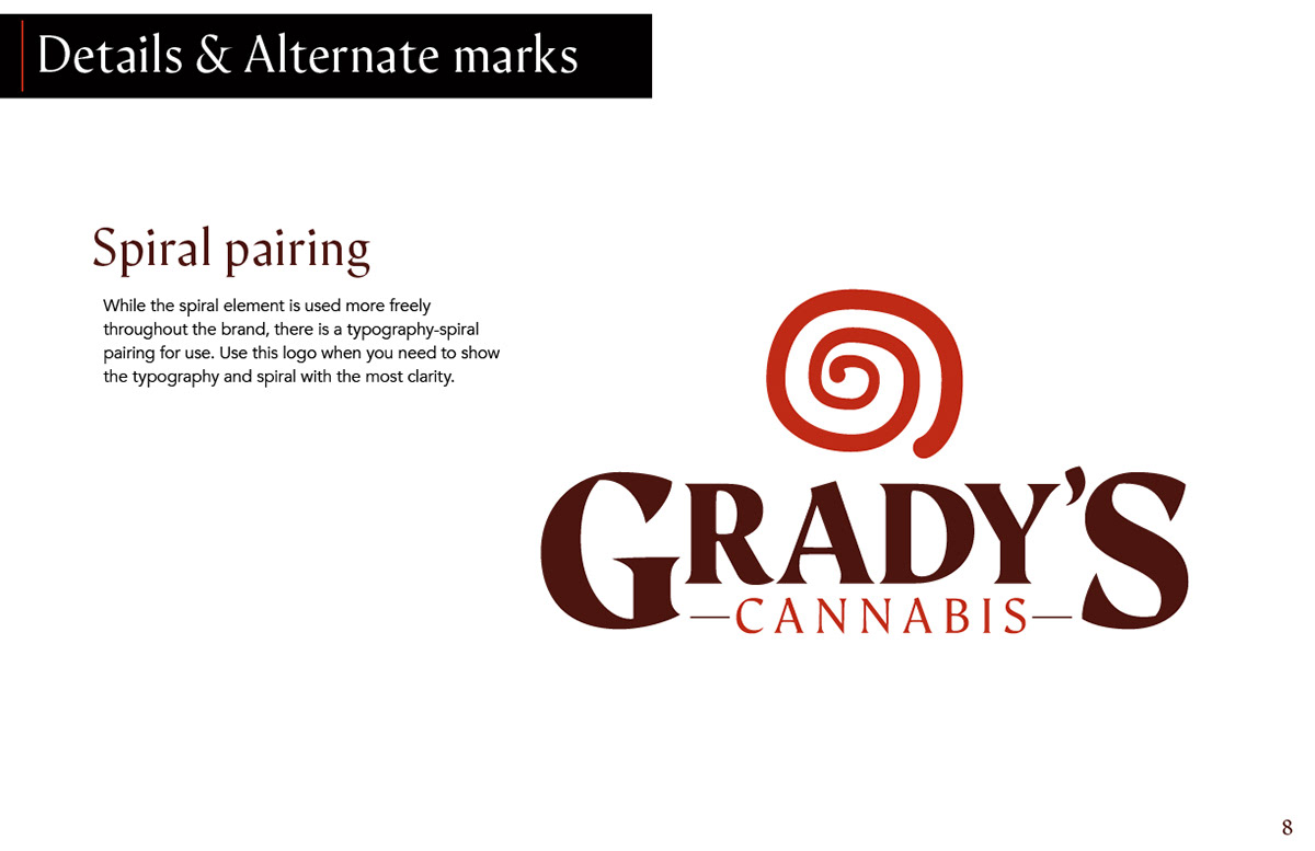
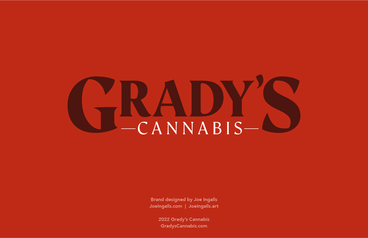
Primary logo

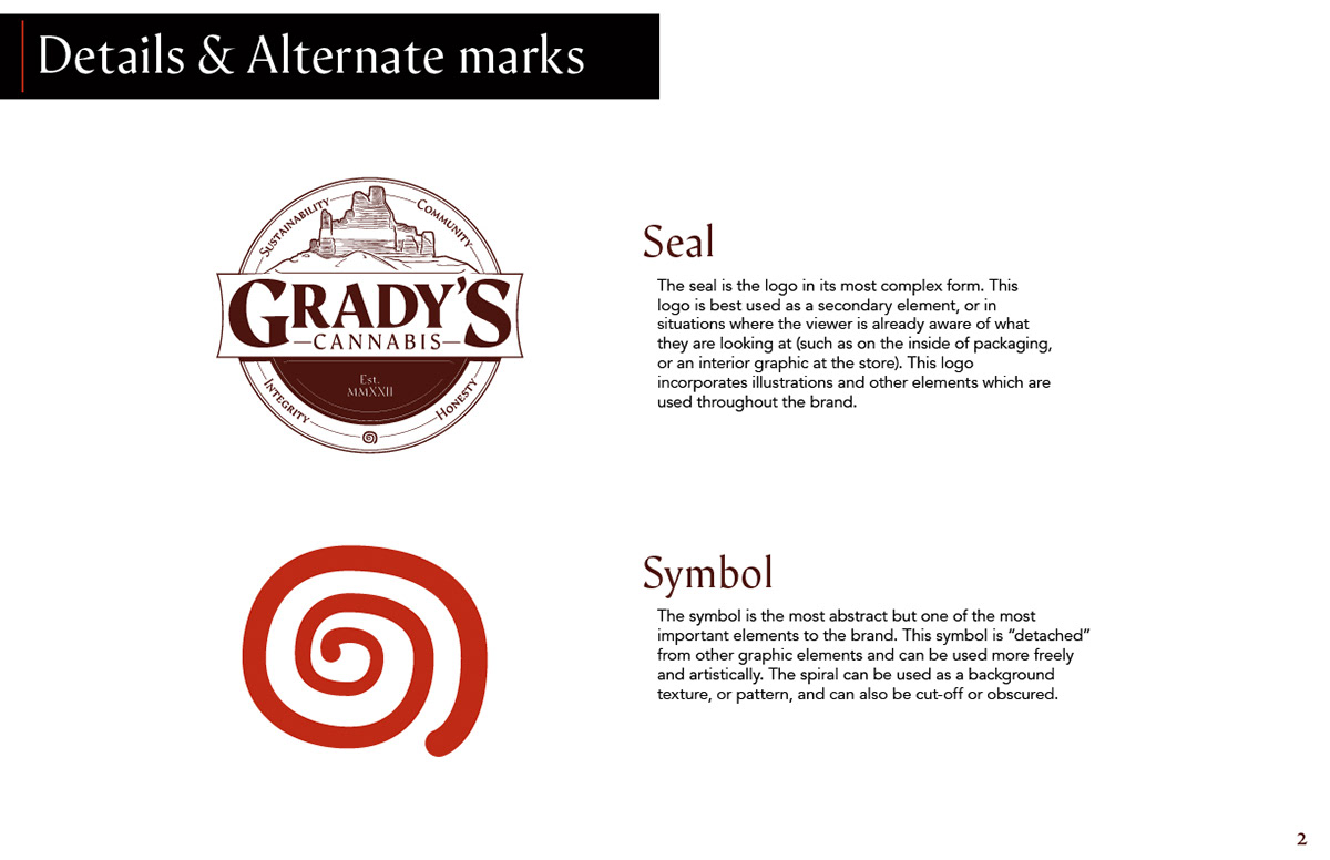
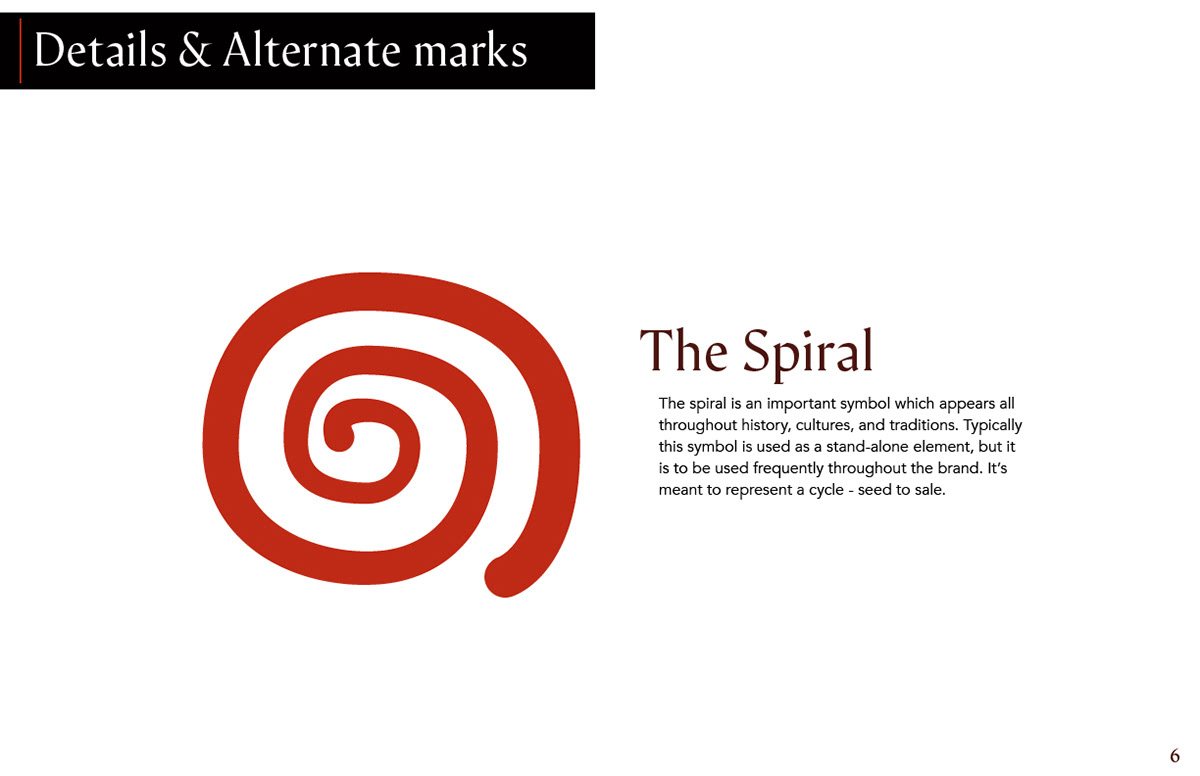
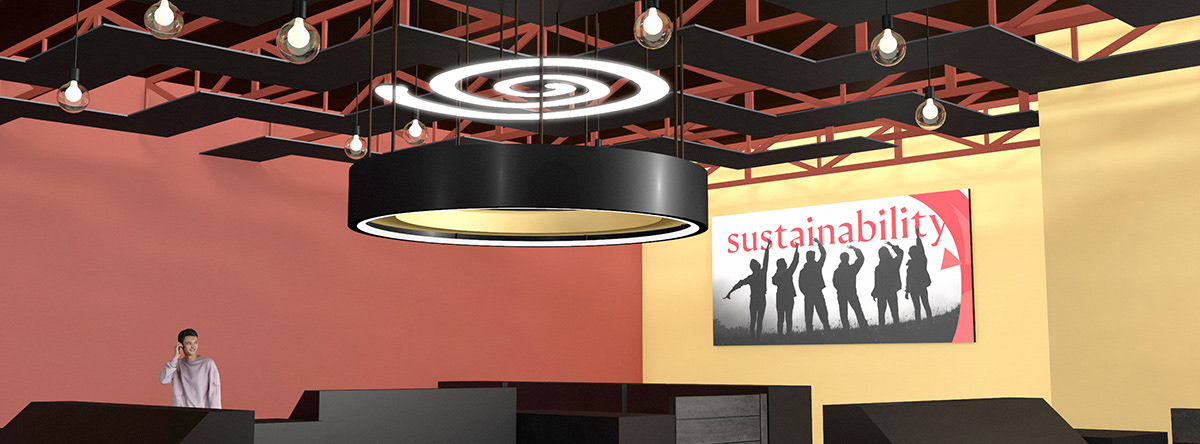
Spiral element
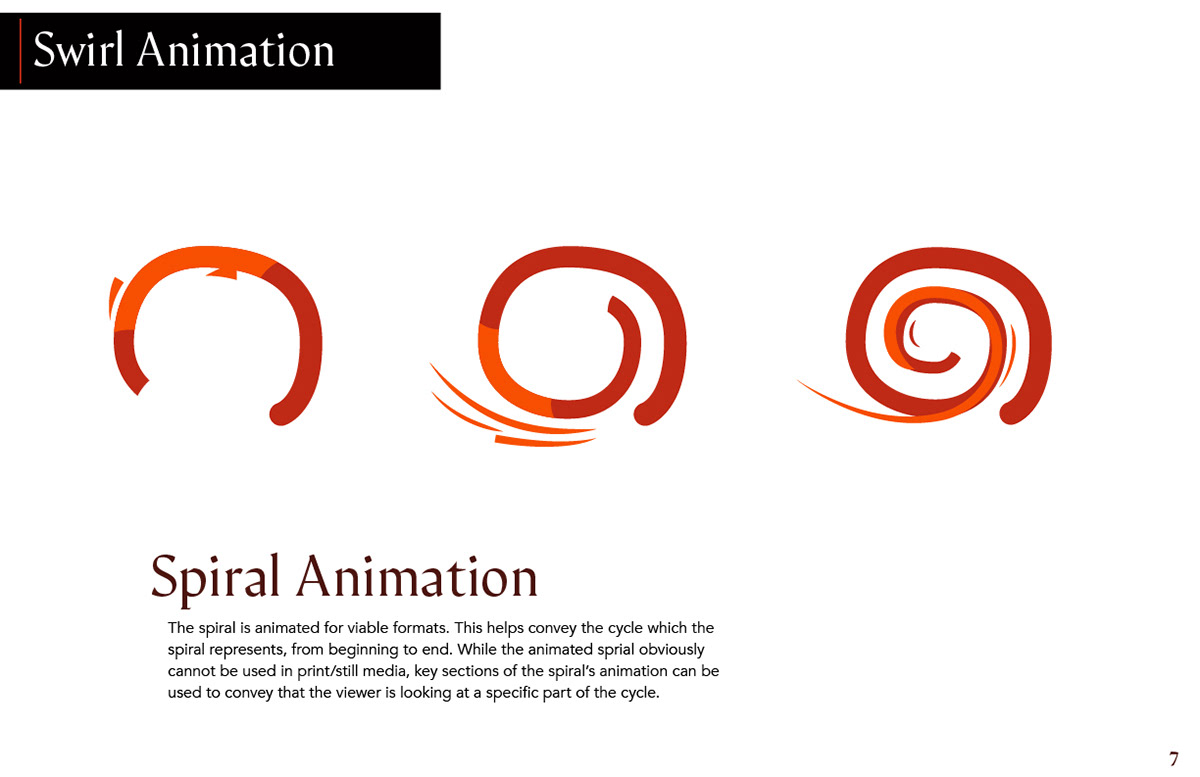
The spiral is an important symbol which appears all throughout history, cultures, and traditions. A similar spiral is on the wedding bands of the owners of the dispensary. It also represents cycles. Grady's Cannabis grows, harvests, prepares, and sells their own cannabis, the spiral is a symbol of this – seed to sale.

The spiral meant to be a core brand element, it's not the logo - but it's as important as the logo. Unlike the logo, the spiral element can "float" in a design, it can be clipped, even heavily obscured. I created the spiral with some imperfections. I wanted it to look drawn by hand – almost perfect – but it has an organic side to it. It's used as a stand-alone element throughout the brand in a variety of unique ways.
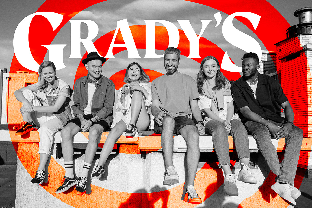
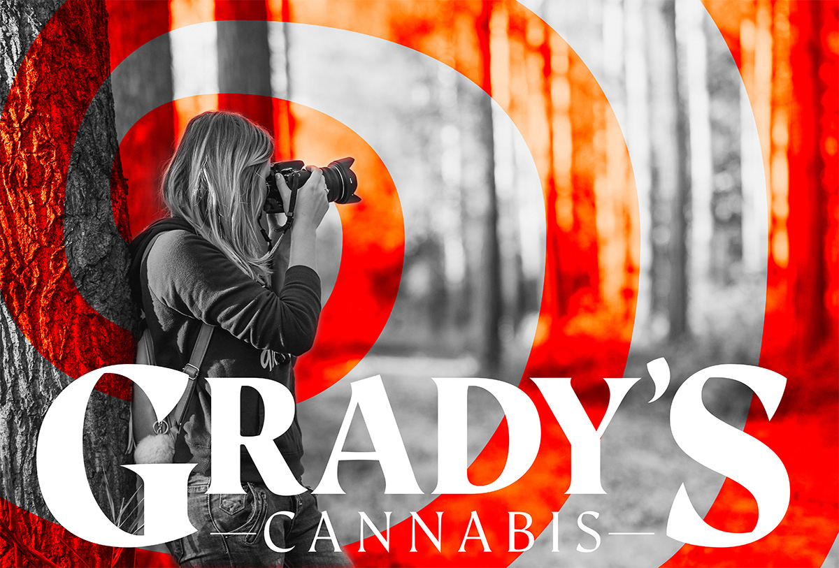
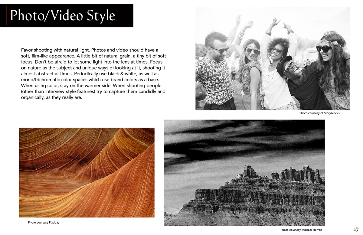
Black and white photography/videography, paired with candid lifestyle imagery play a key element in branding.

Style–Guide
A style–guide is a crucial document in creating, planning, and maintaining a brand. A style–guide consists of logos, brand elements, marks, colors and how to correctly use them. A good style–guide is balanced. It needs to be thorough enough without being overly rigid. A style–guide without enough detail and rules can make a brand look sloppy or inconsistent. A style–guide that is too restrictive can kill creativity and natural brand evolution. Below is the style–guide I created for the Grady's brand. It is a living document, and is updated frequently.


Motion Graphics & Animation
I created a motion graphics suite for in-store use as well as promotion across digital media platforms. The idea is to show off a little branding and some temporary sales, promos, and other announcements all within a continuously updating motion graphic suite. I also created promotional animations for key brand partners which are also shown in the below sequence:
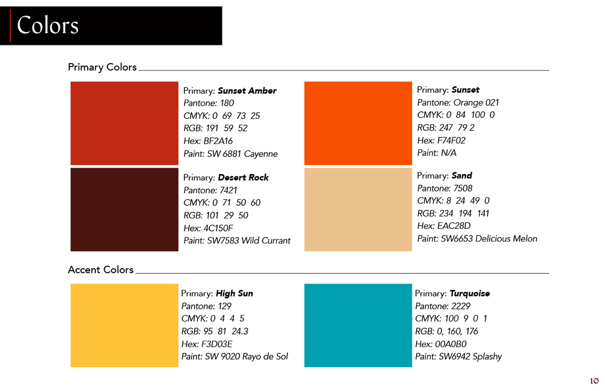
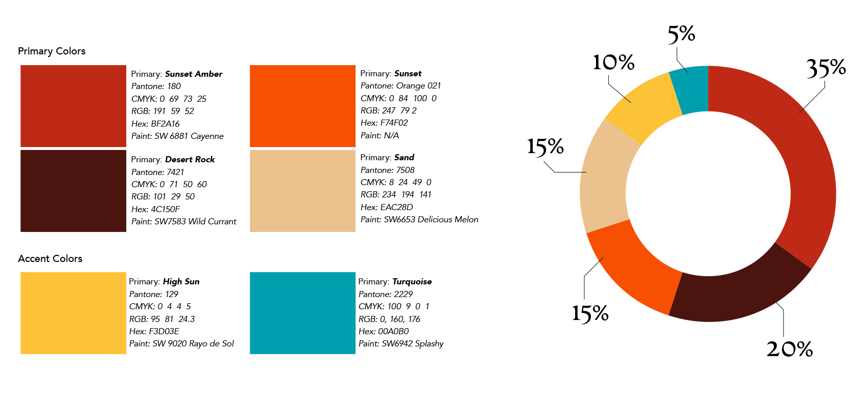
Colors
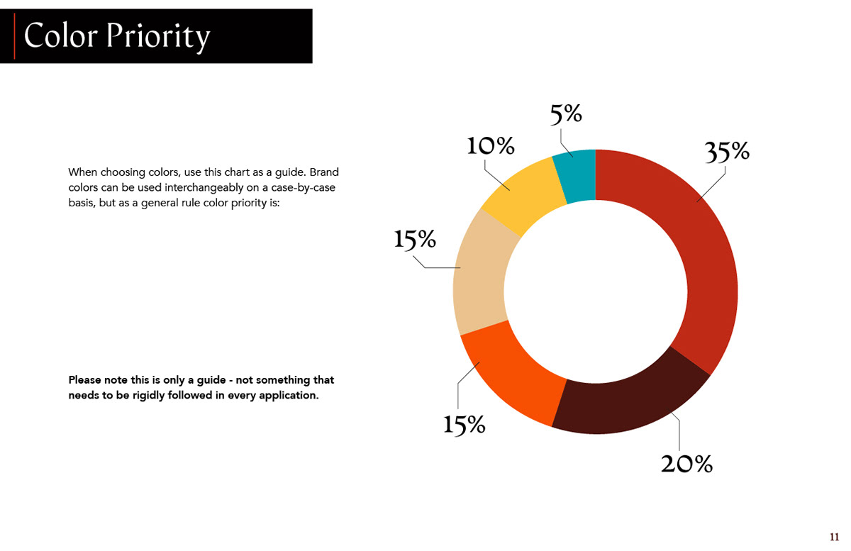
We decided early on that we would avoid green altogether within the brand's colors as so many cannabis brands use it. Some colors were inspired by the local area and local material, some came from sampled and adjusted colors from sunset photos. Below are the colors I chose, their information, and the intended color hierarchy for the brand. The color hierarchy is meant to be an overall guide for reference, not something that needs to be rigidly followed in every application.
Additional branding elements:
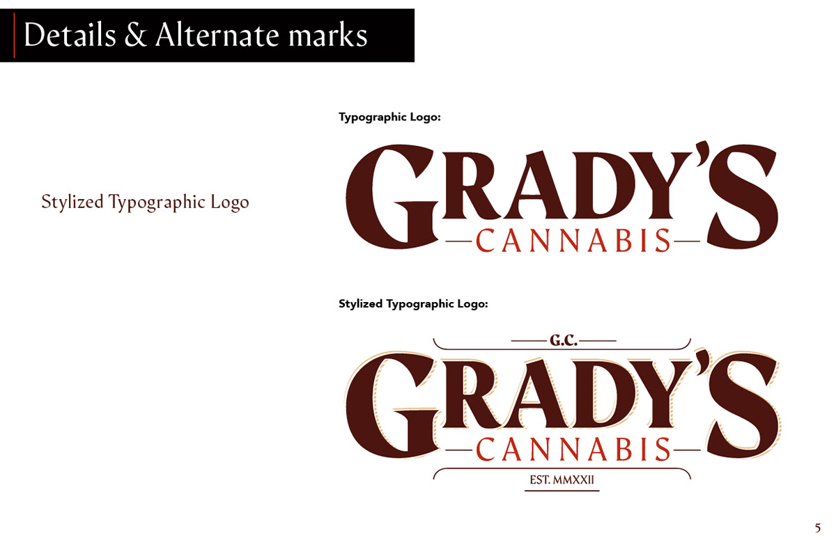
Stylized Typographic logo
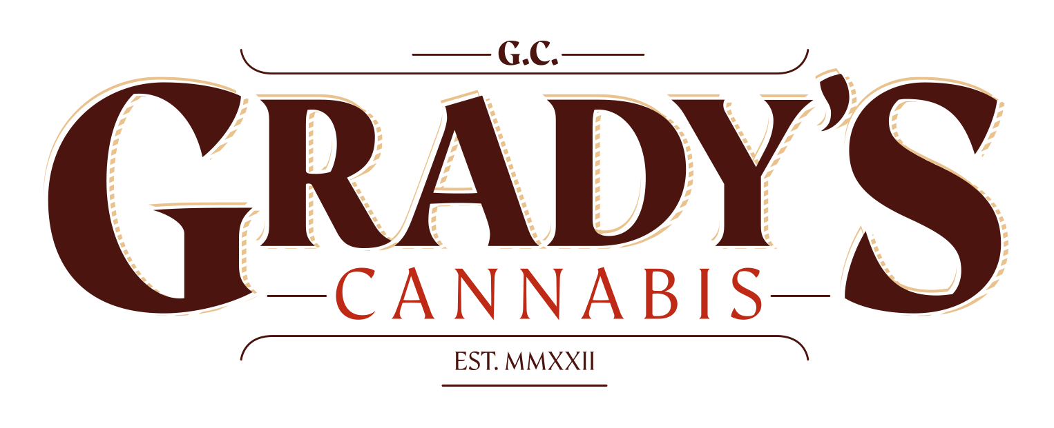
The stylized typographic logo is the most overt in its historic influence. It has accents around the letters, a cross-hatched shadow element, initials, additional lines, and a Roman numeral ‘established’ date.
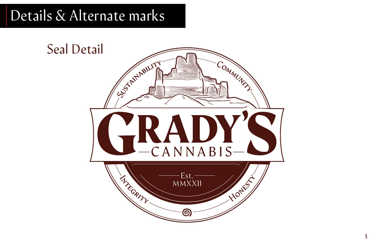
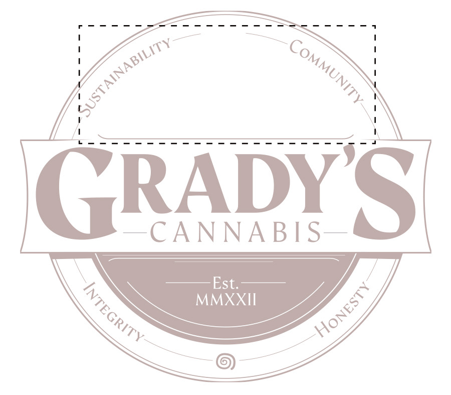
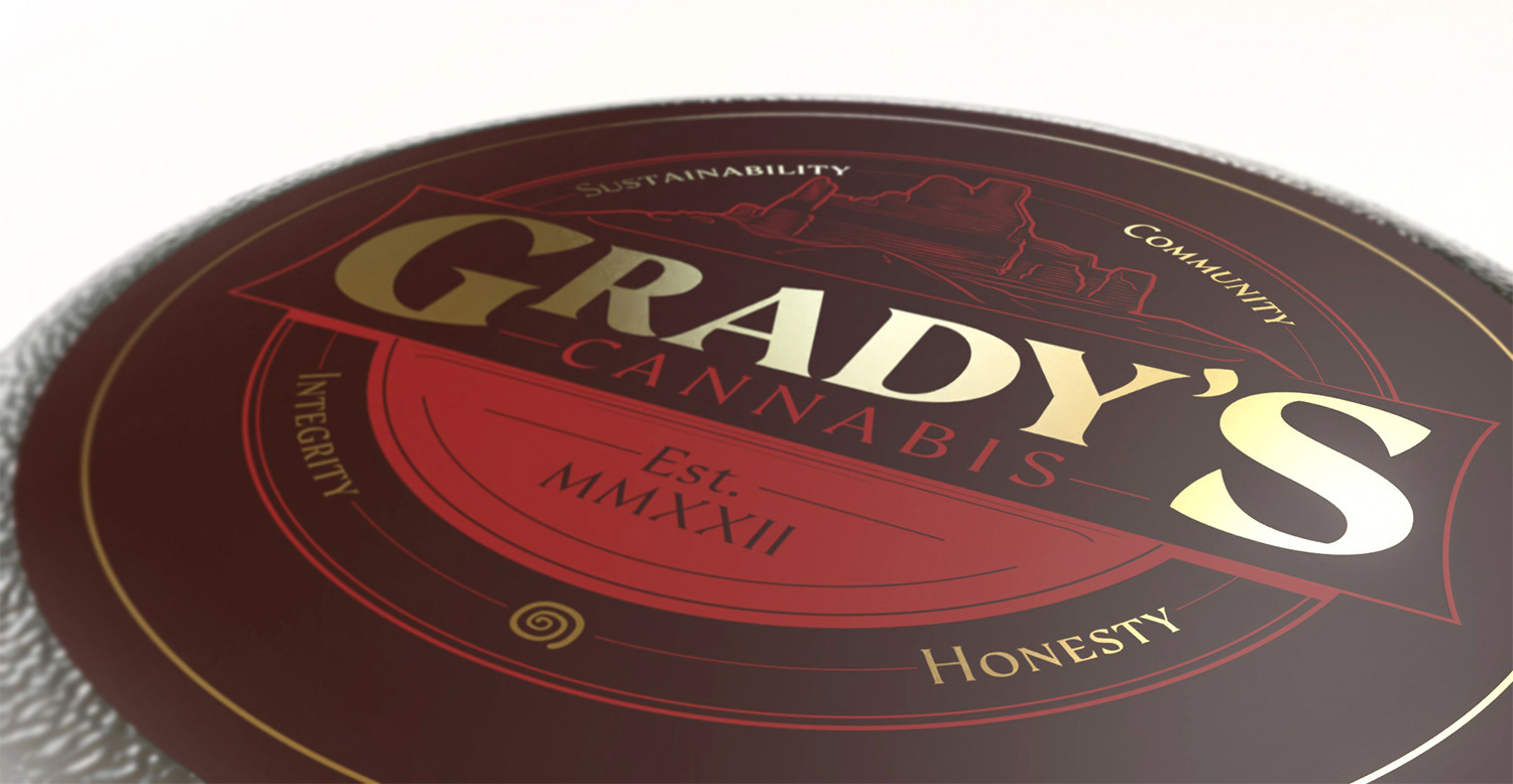
Grady's Seal

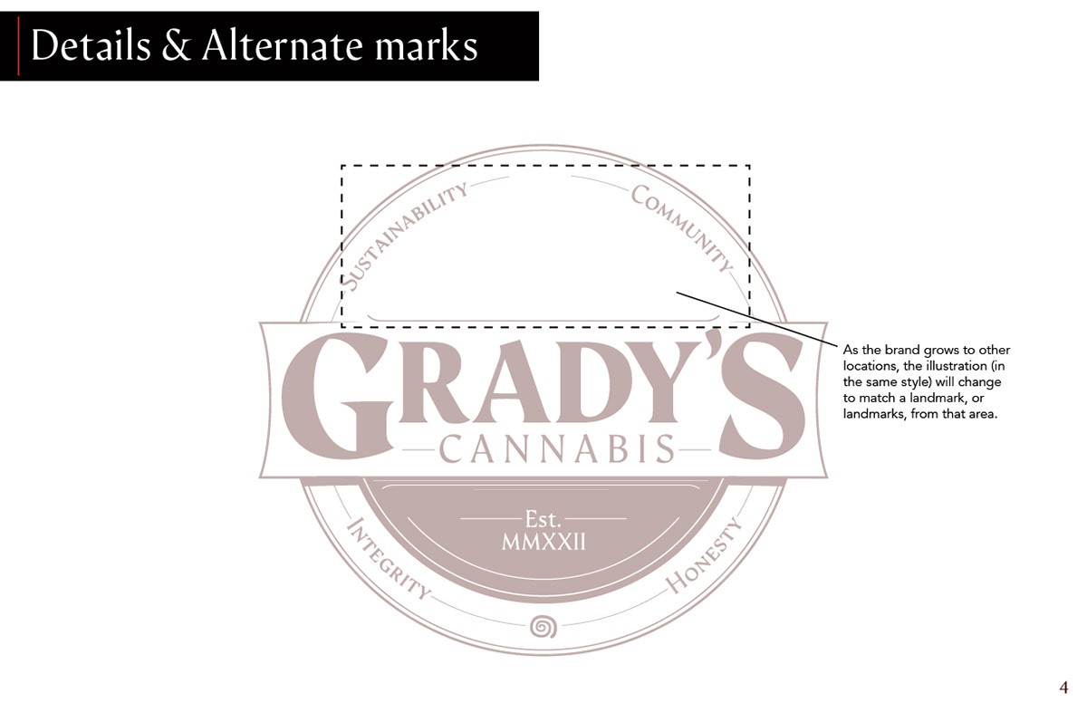
The seal highlights a landmark and highlights the core values of the company. This particular seal is to be used in and around the Aztec/Farmington area, as the mesa in the logo is of Angel Peak, a local landmark.
As the company grows, and dispensaries are opened in other cities (and potentially states), additional seals will be made. Each dispensary would have a significant local landmark, or landmarks, drawn in the same illustration style as part of its seal design.
Local landmark(s) featured here:
All logo variants and elements:
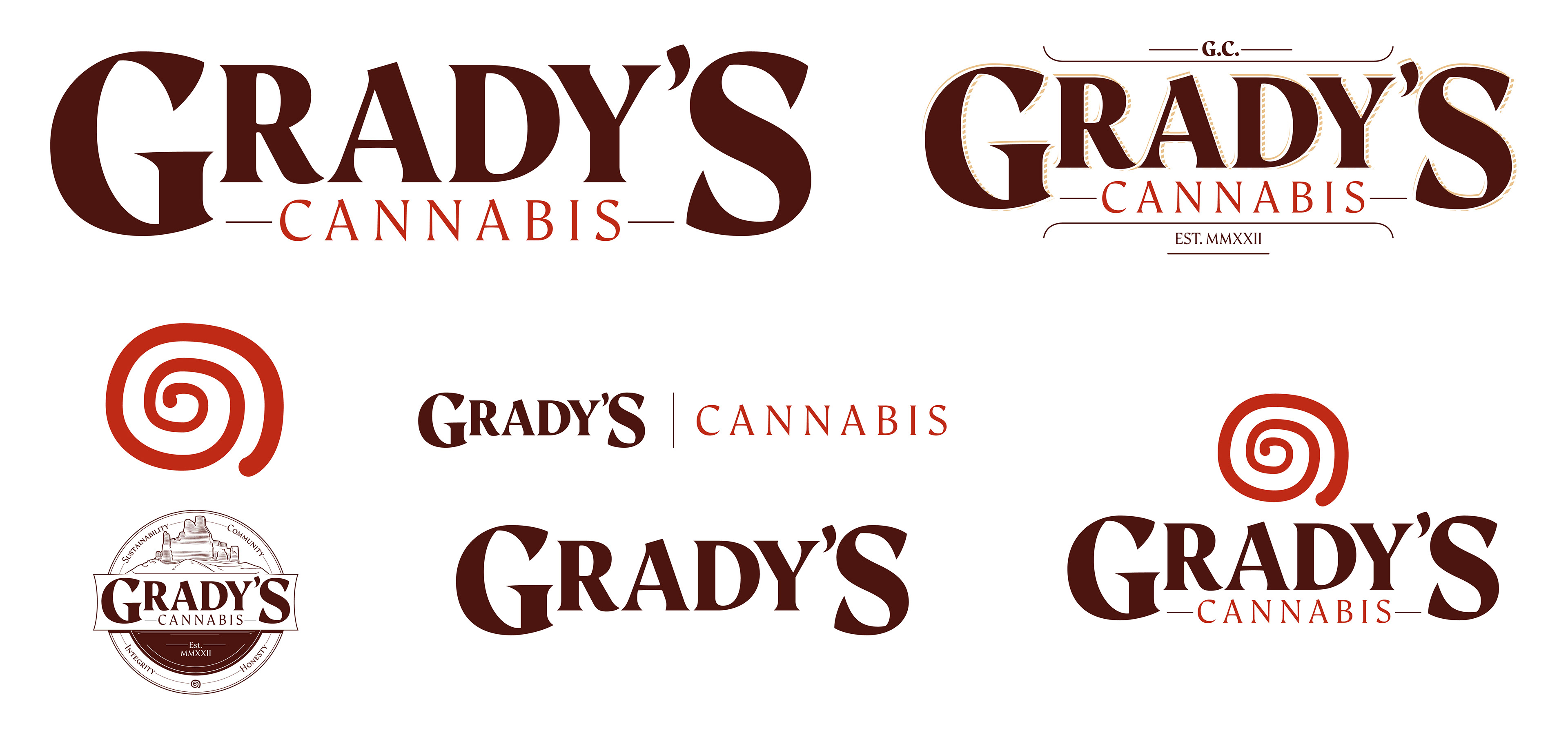
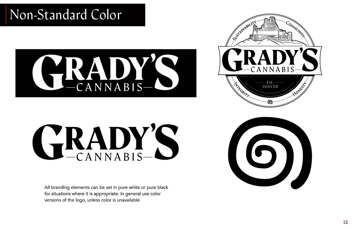
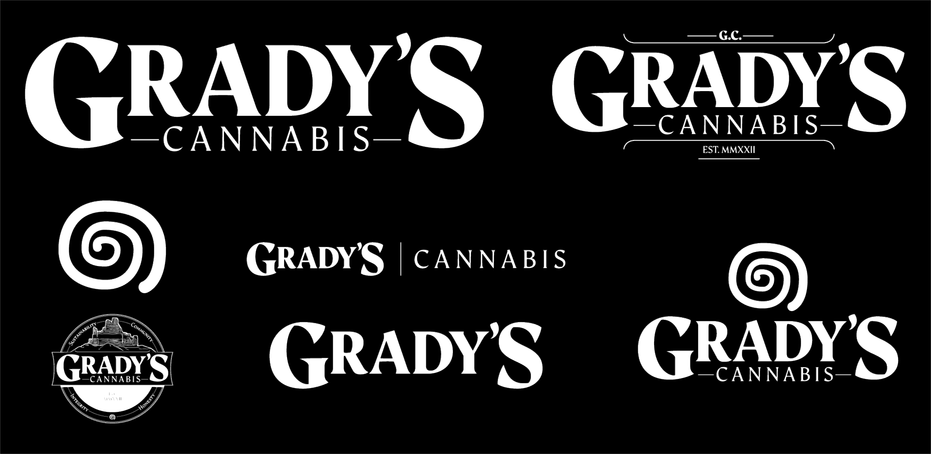
All logo elements can be set in solid black, or white as well.
First printed piece
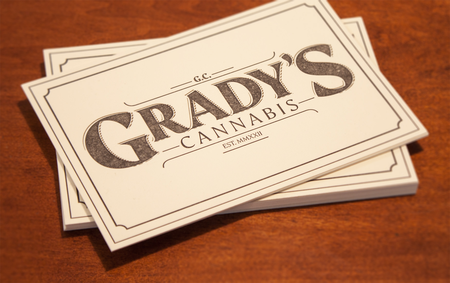
There's something about seeing a design physically on something for the first time. It makes it tactile, it makes it real. I wanted the first printed piece for this brand to be something special. I used a letterpress print shop located in my area that has an historic letterpress. The letterpress I used originates from a similar time period in history as the Grady's logo is inspired from, so it was a natural, and perfect fit.
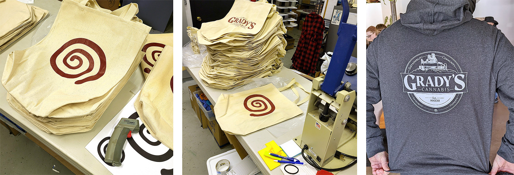
Special thanks to Mysterious Ink for their expertise, they helped out with screen-printing apparel and merchandise as well.
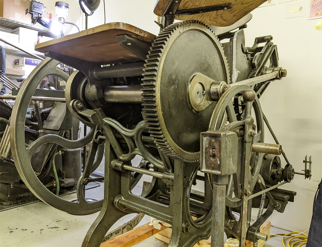
A short video of the letterpress running:
A short video of the letterpress running
Apparel and Merchandise
For the grand opening of the store, I created a variety of promotional product graphics.
Grady's Hoodie:

The design features the spiral symbol on the front, and the Grady's seal on the back side.
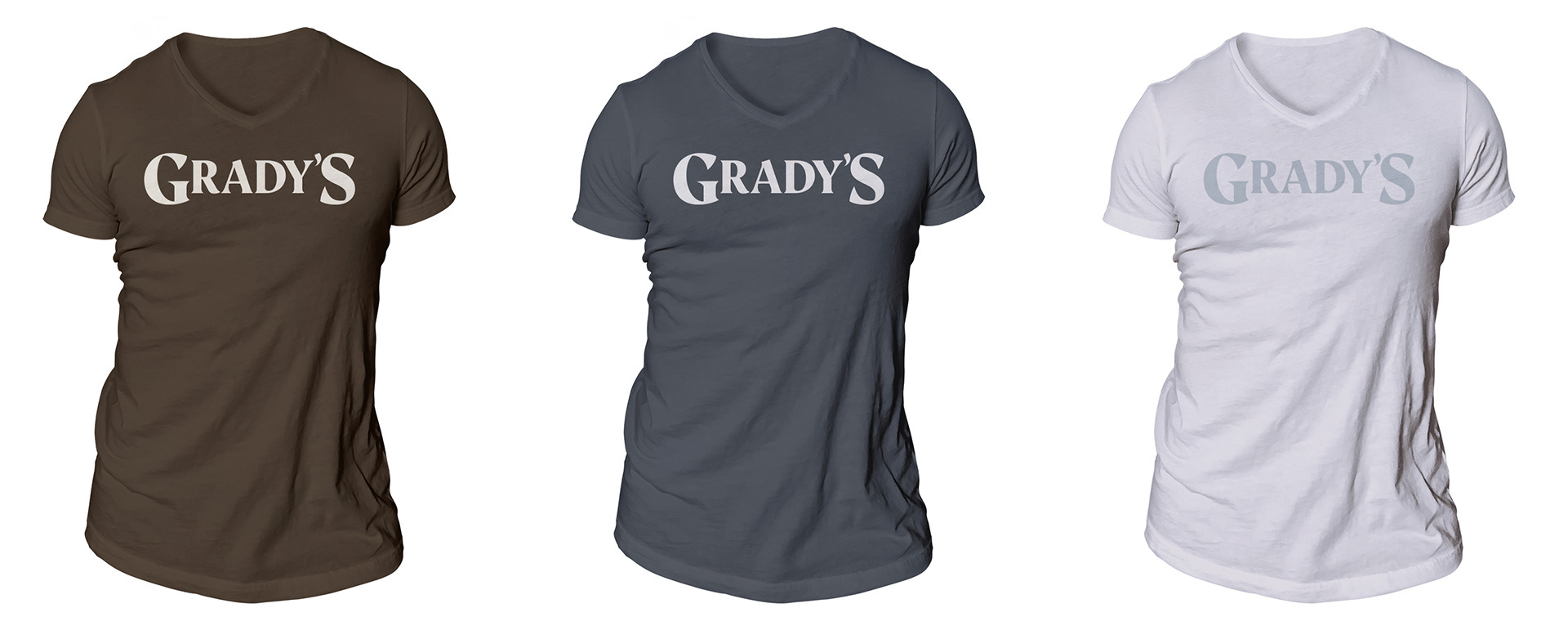
The first round of t-shirts used the simplified typographic logo variant and came in three colors:
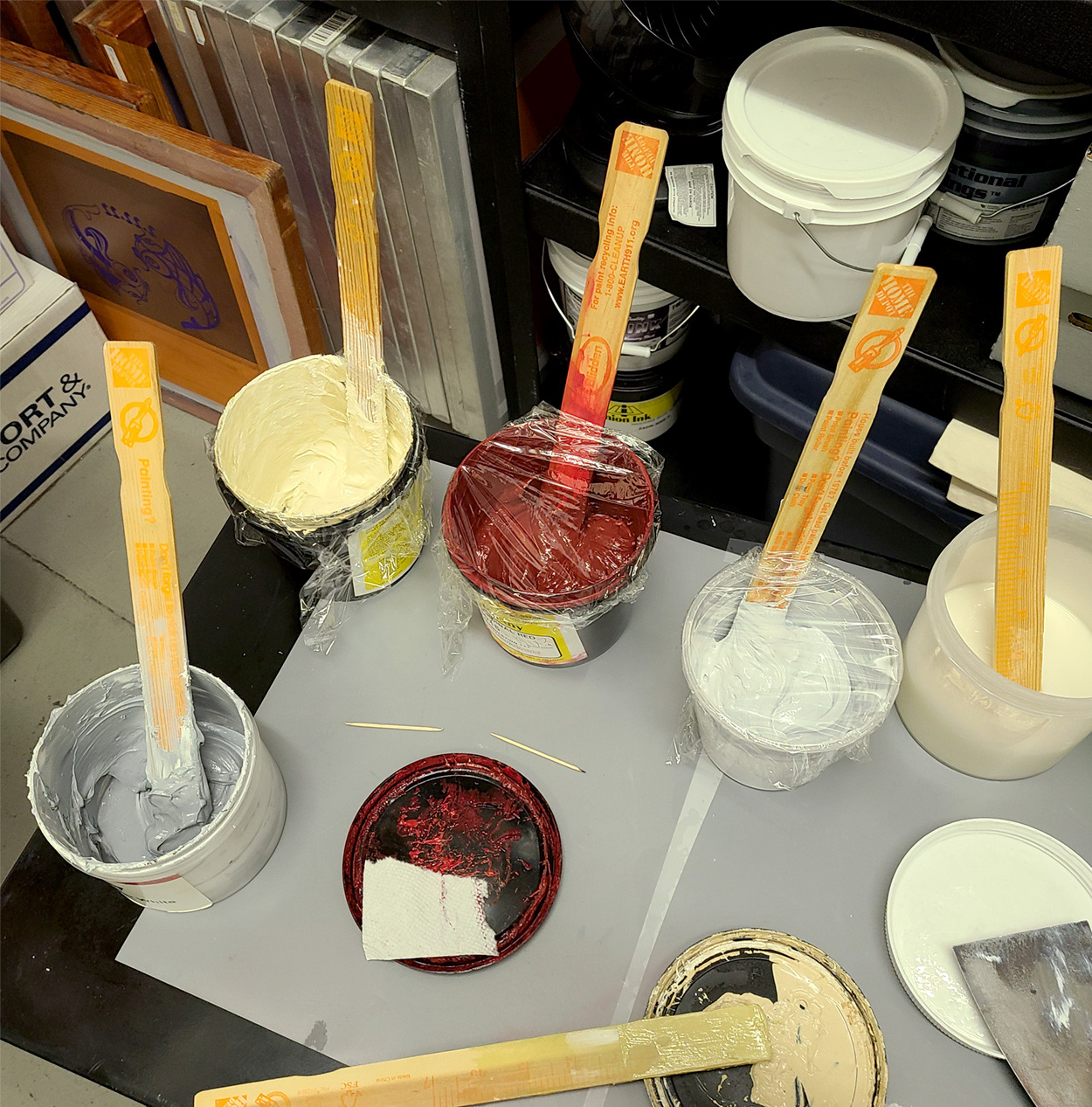
Ink being mixed for the screen printing process:
Tote bags were also made, with the spiral on one side and the stylized typographic logo on the other side.
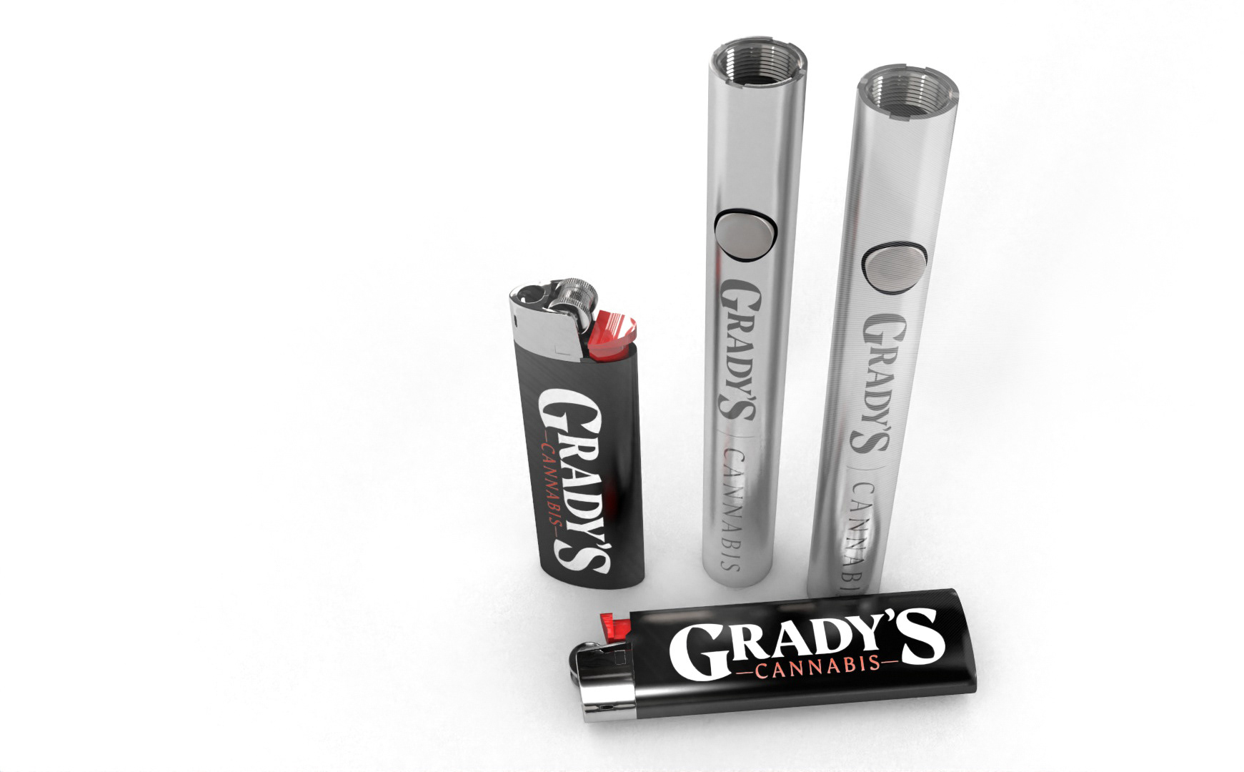
Lighters and batteries utilizing different catered logo formats:
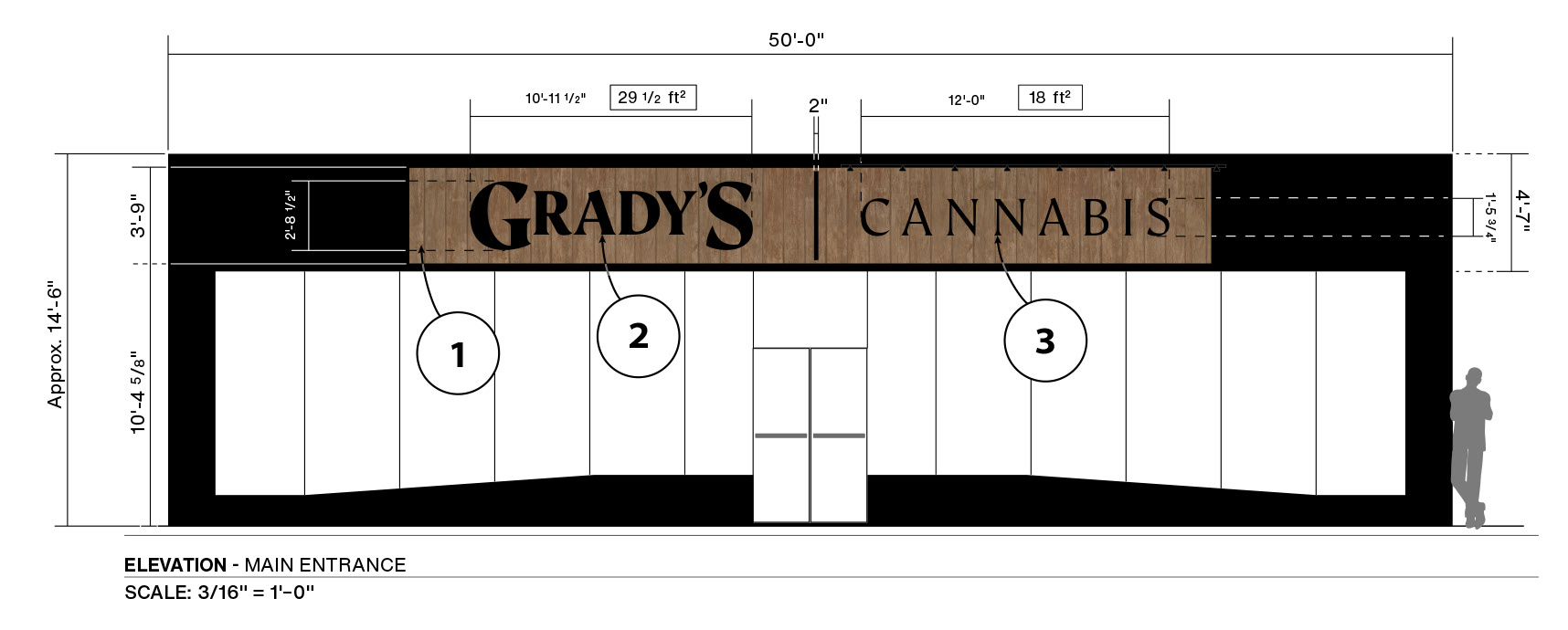
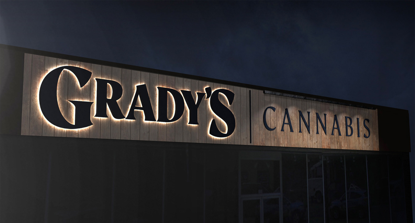
Sign Design
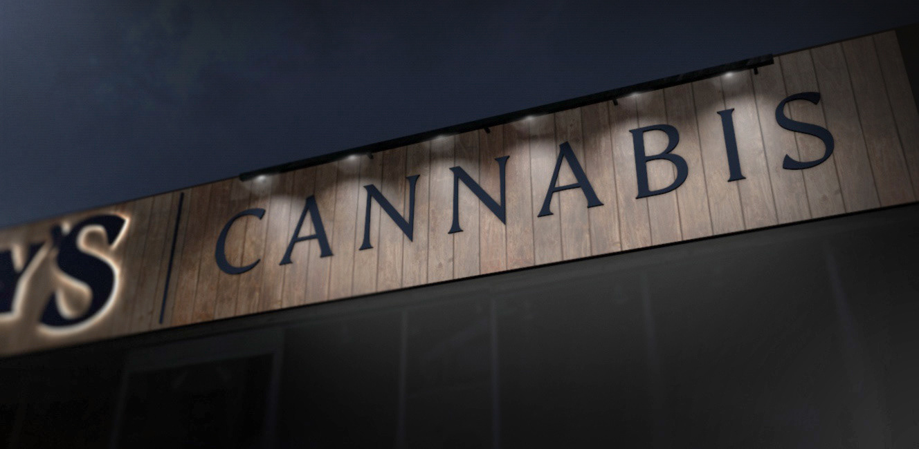
After exploring a few different sign concepts, we settled on reverse channel letters (halo lighting effect) for the Grady's portion of the logo, and stud-mounted, painted aluminum letters for the cannabis portion of the logo (and dividing element).
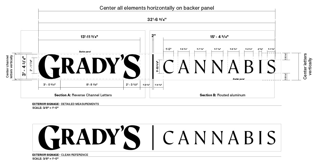
Below are excerpts of the plans I designed. These plans were used to receive permit approval from the City of Aztec, New Mexico.
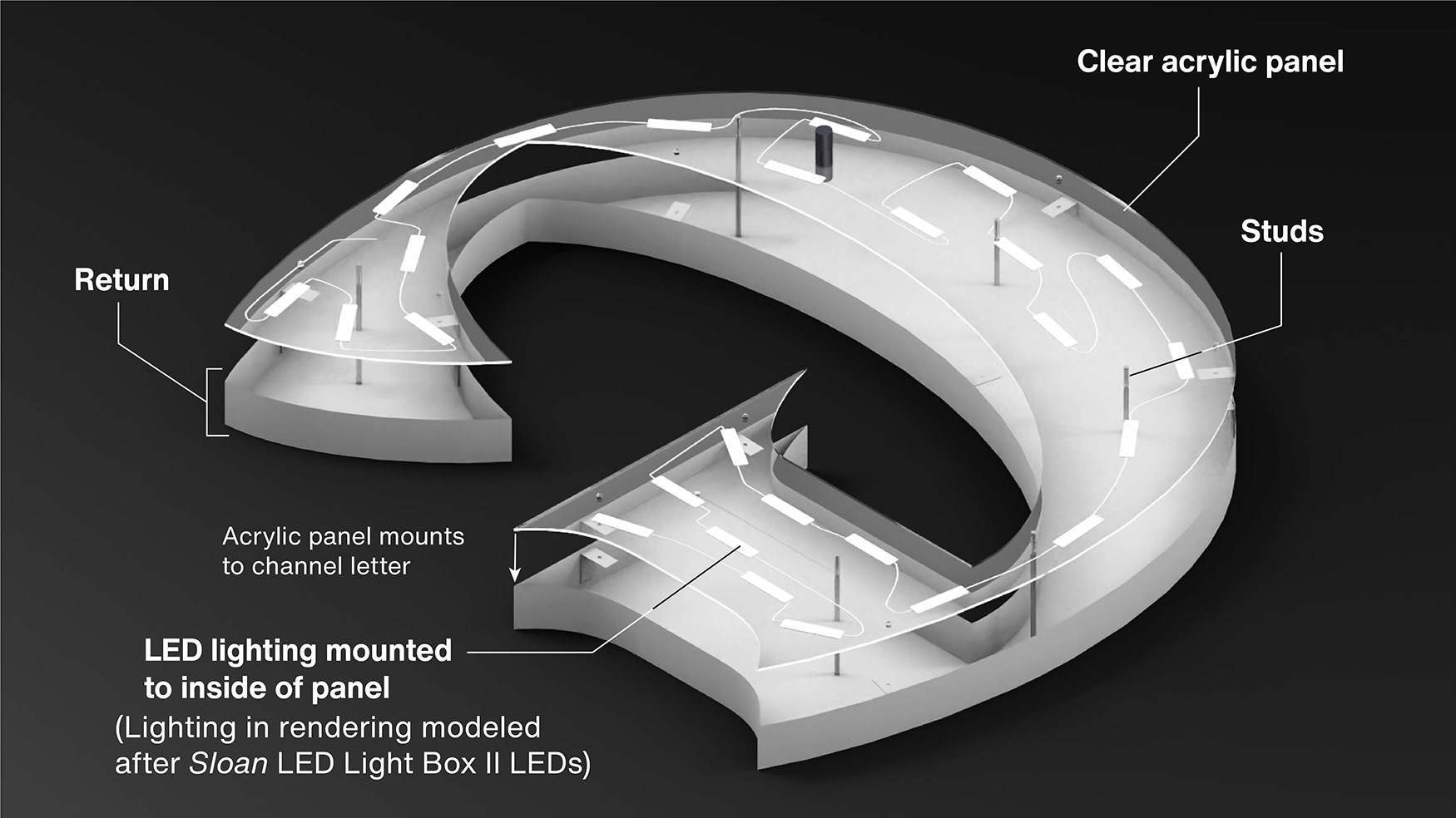
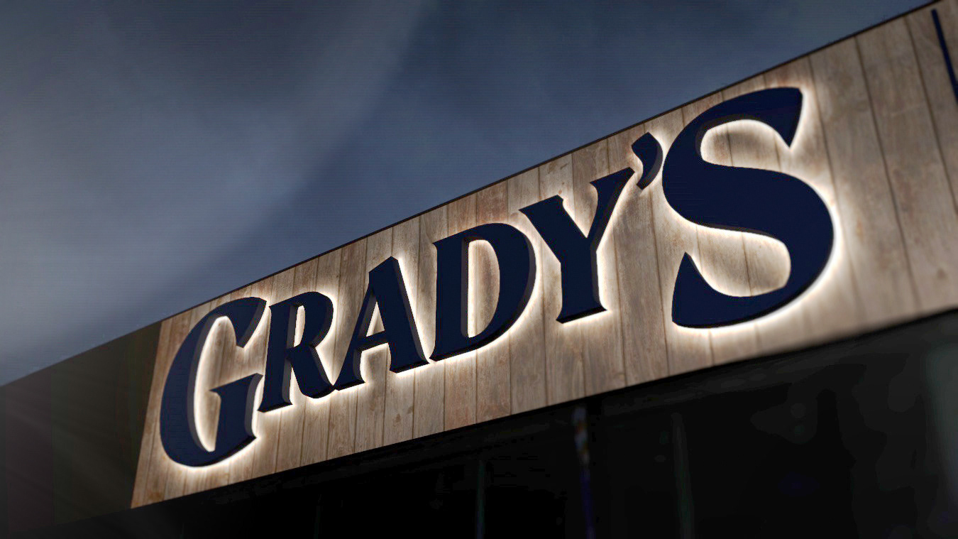
(Below) A detail showing the back-side of one of the reverse channel letters I rendered. LED lighting attaches to a clear acrylic panel (cut to the same shape as the letter) which face towards the inside face of the letter. The light then bounces off the inside face, sending light back through the clear acrylic face, creating a halo effect on whatever surface the letter is mounted to. The letters are mounted 2" off the building surface with studs and spacers to purposefully let this light escape.
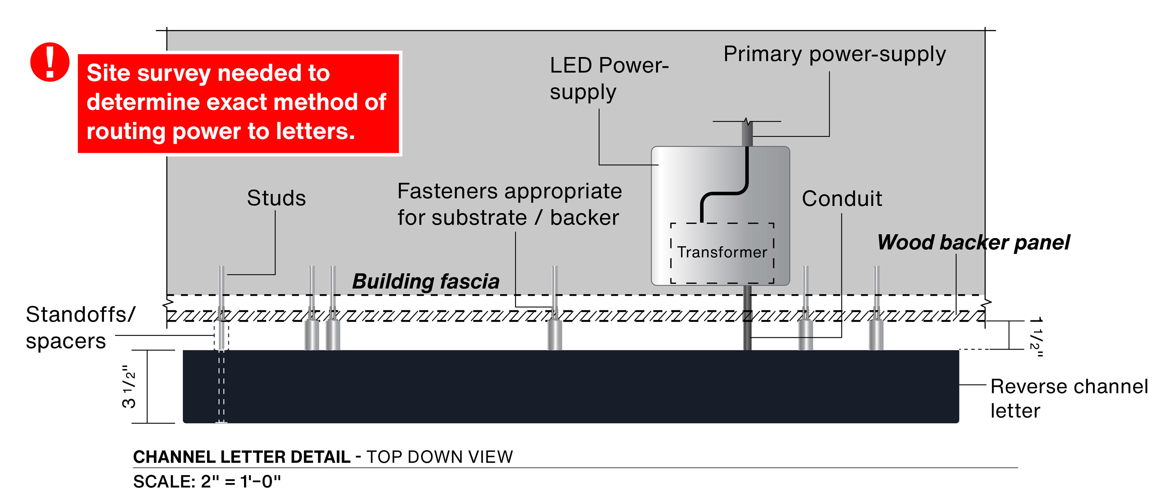
A detail explaining power and mounting method:
Concept renderings I created, showing the intended effect:
Detailed spacing, and placement of logo elements for sign installers:
The final installed sign:
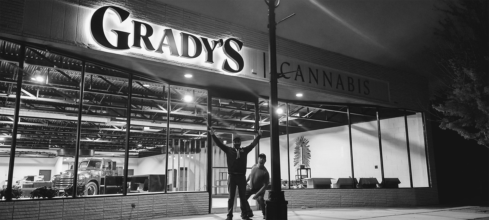
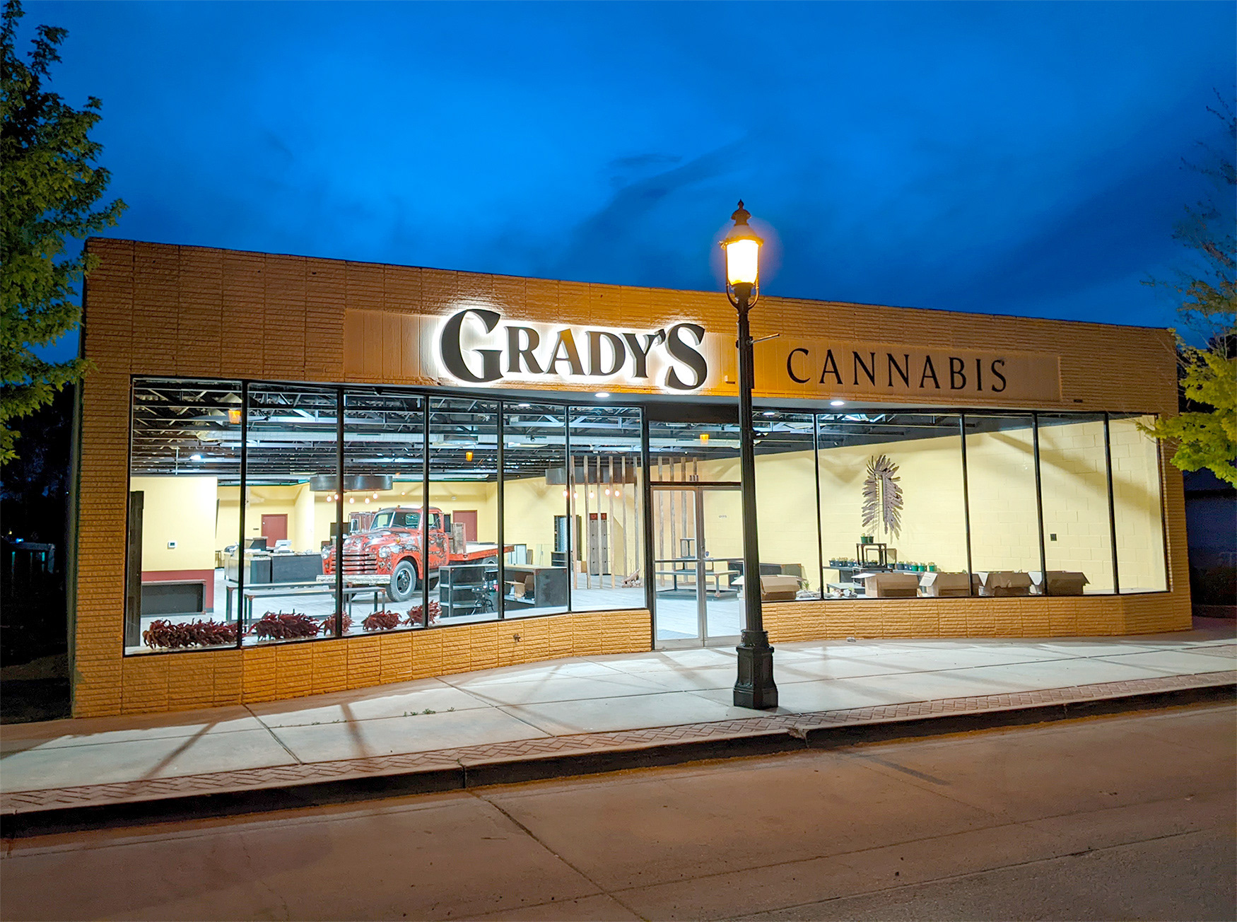
Photos courtesy of Grady's Cannabis
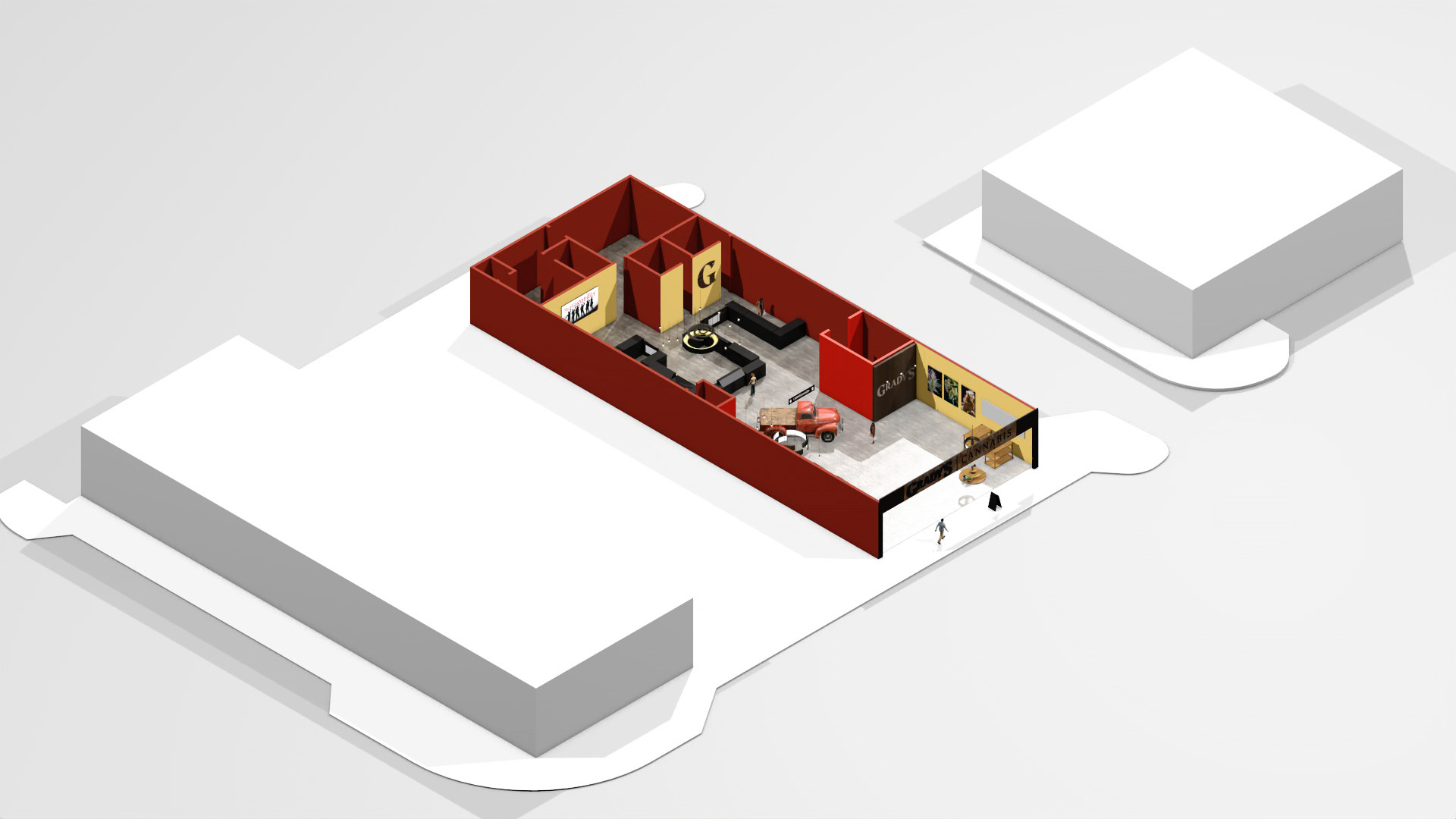
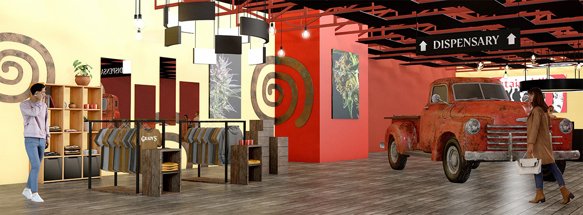
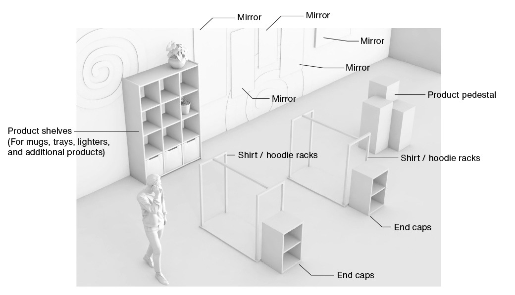
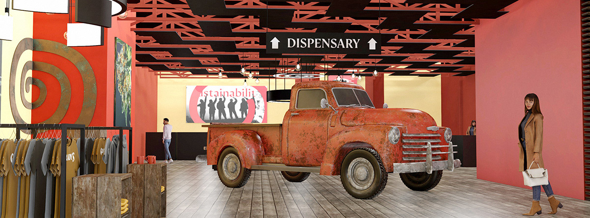
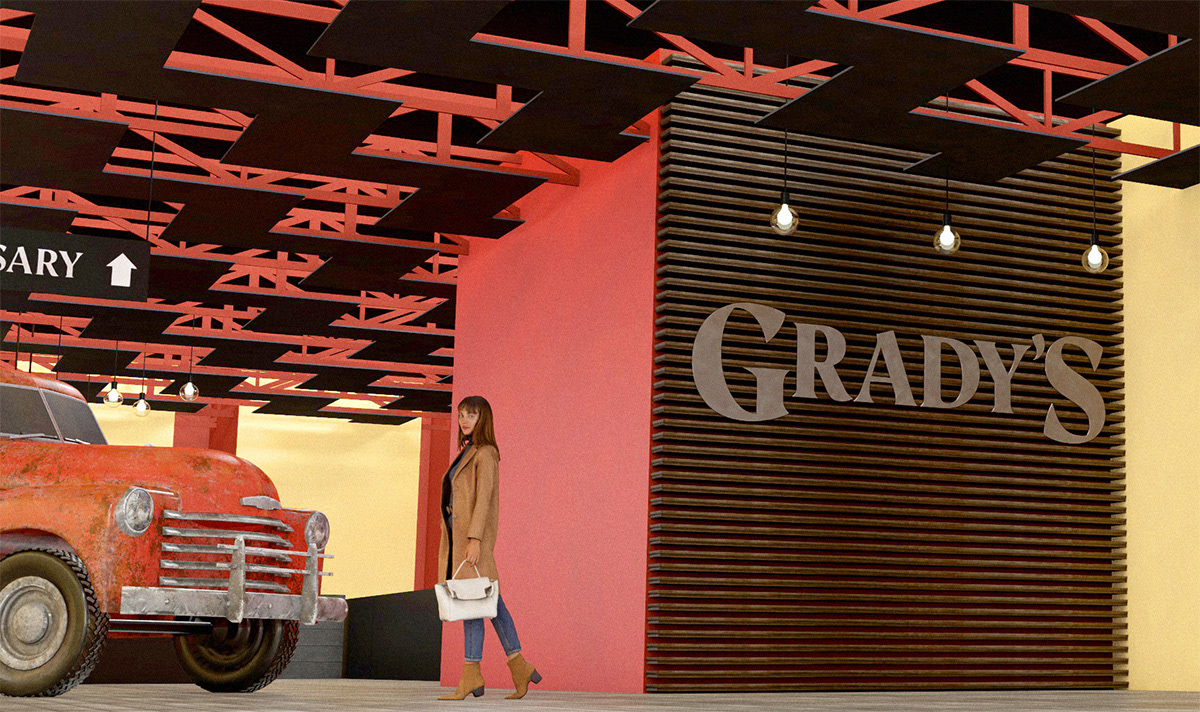
Interior renderings
I was given the 2D floor-plan of the building early on in the process. Referencing it, I was able to create a detailed 3D scale model of the entire building. This let us visualize the construction process along the way. We could even choose paint colors, move furniture (as well as ensure furniture will fit prior to moving it into the location), walls, and other elements, in real–time, inside the 3D model prior to committing to them.
Isometric view of the dispensary and adjacent buildings:
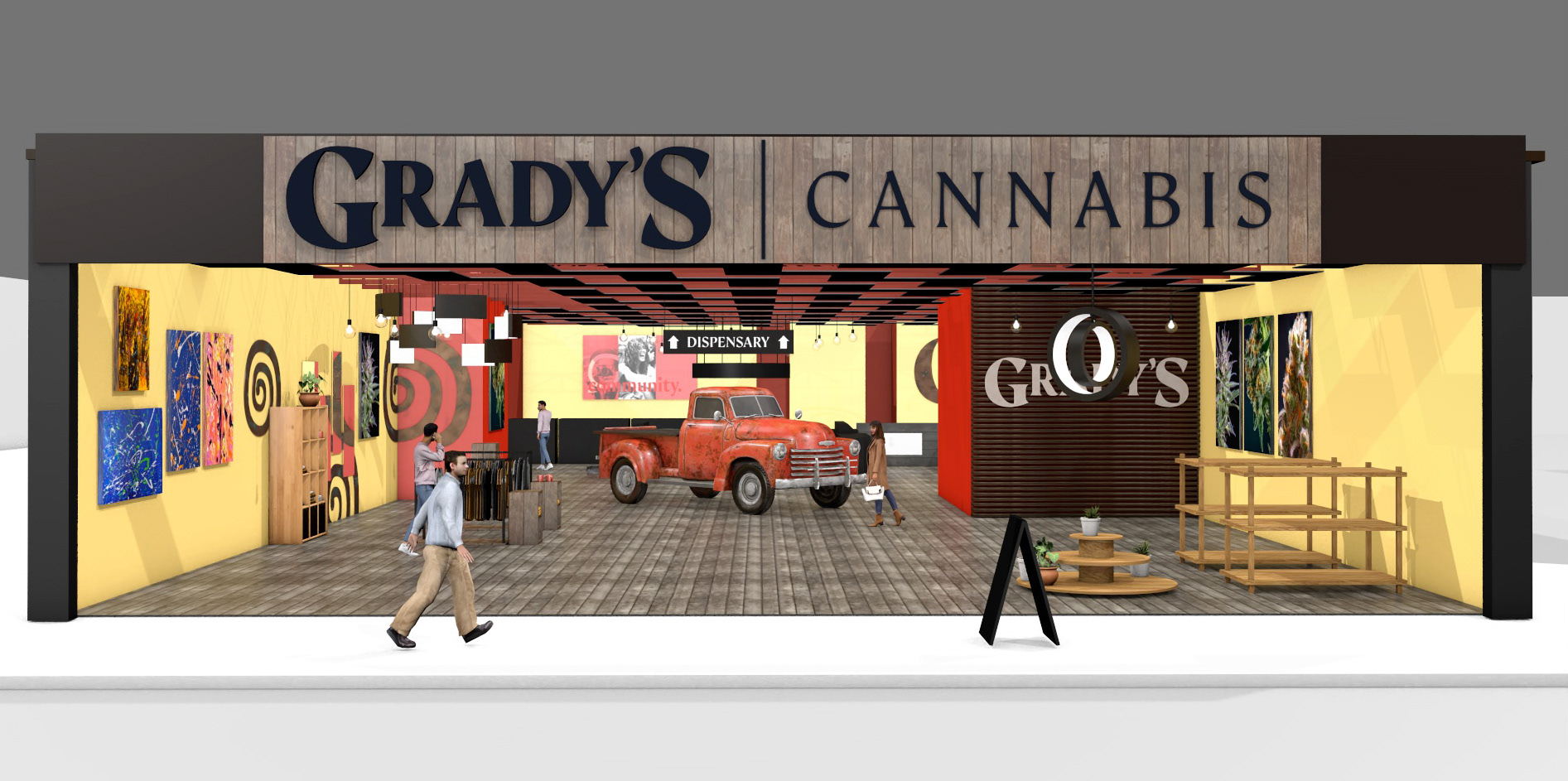
Merchandise area detail:
The front half of the building acts as an all-purpose space, being used for farmers markets, art showings, and other community events with the exception of the merchandise area which is permanent. The dispensary itself is in the back quarter of the building.
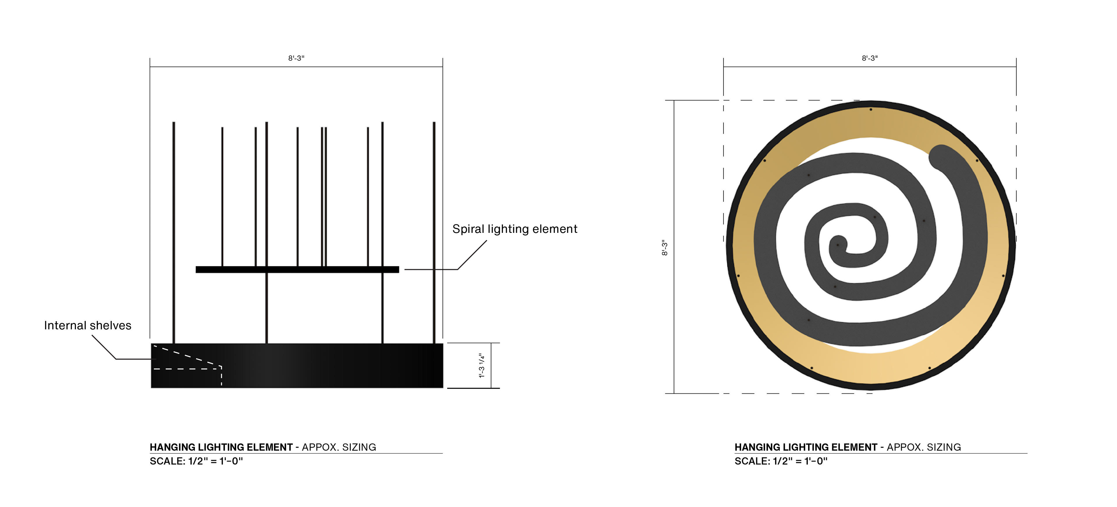
Detail highlighting a hanging lighting element. This feature would also store products inside so employees can easily access additional products (similar to a convenience store cigarette rack):
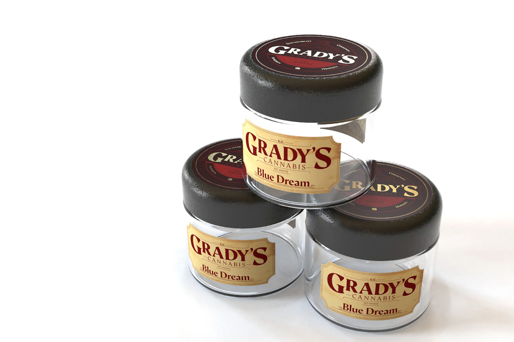
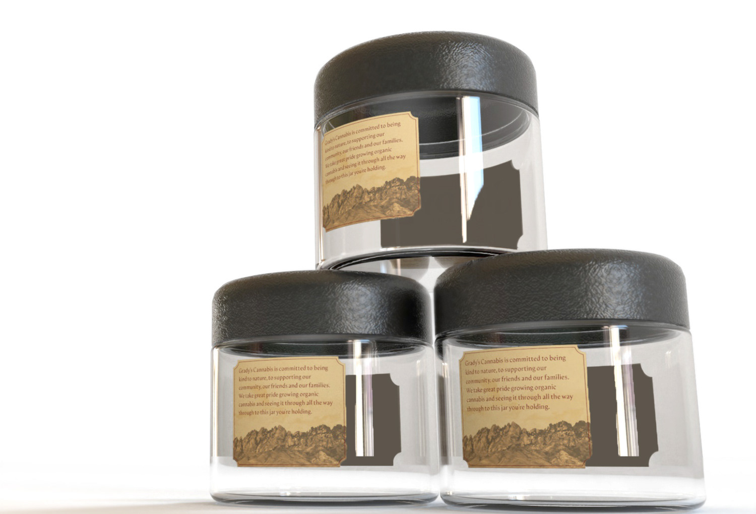
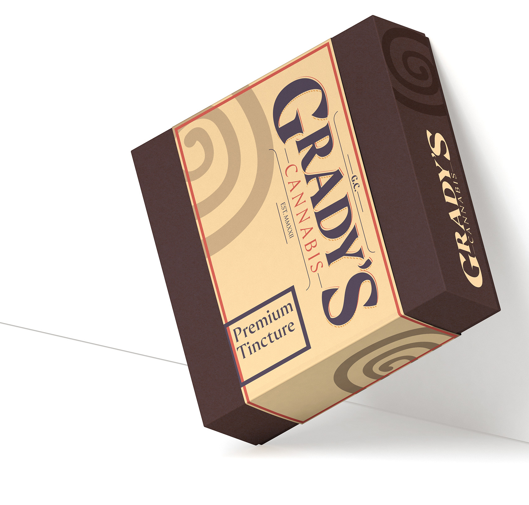
Packaging
The packaging design phase of this project is ongoing, and evolving. Below are some initial concepts and renders.
This is an ongoing project which will be continuously updated.
